
GDP Growth
average growth rate by decade

This is the first edition of the United Kingdom Index of Systemic Trends. The UK Index is a dashboard on the performance and health of Britain’s political economy.
The UK Index seeks to assemble and provide the evidence in one place for a judgment as to the fundamental orientation and long-term direction of travel of Britain’s political economy as a whole – something largely absent from most of the present UK policy discussion.
It is intended as a corrective to overly narrow and short-term-oriented policy discussions in Westminster that continually miss the big picture of Britain’s longstanding decline by getting lost in the weeds of the latest policy relaunch, think tank report, or shallow political fad.
In addition, it offers a possible baseline and barometer by which can be judged the policy and political programmes of those who seek to offer easy answers – or, worse, the rebadging of past problems as future solutions – to the manifold structural social, economic, and political challenges facing Britain in the months, years, and decades ahead.

“All across the UK Index of Systemic Trends the dashboard warning lights are blinking fiercely, indicating the magnitude of the crisis that is unfolding – and will continue to unfold, unless there is a radical change in direction.”
The Democracy Collaborative first developed the Index of Systemic Trends for the United States of America, publishing a first edition of the U.S. Index in 2019 and a second edition in 2024.[1] With it, we have been able to predict with broad confidence the political and economic direction of the United States even in a time of extraordinary turmoil and chaotic change.[2] Taking the longer view helps reduce the noise and keeps the fundamentals in sight. In a time of crisis and flux, in which the recent past is no longer a reliable guide to the near future, the long-run trends are both clarifying and deeply unforgiving.
This looks likely to be just as true for Britain as it has been for America. As with the U.S. Index, our intention will be to revisit the data with a new edition of the UK Index every five years – a suitable time period after which to check back for substantial changes in direction.
Our findings in this first edition are stark but unsurprising.
All across the UK Index of Systemic Trends the dashboard warning lights are blinking fiercely, indicating the magnitude of the crisis that is unfolding – and will continue to unfold, unless there is a radical change in direction.
A political economy is a system, and the current system is organised to produce economic concentration, financial extraction, growing income and wealth inequality, and widening regional disparities.
This is even before we feel the full impact of ongoing and future shocks and disruptions such as climate change, artificial intelligence, and the increasing regionalisation of the global economy into competing (perhaps even warring) rival blocs.
By the measures included in this Index, the United Kingdom would seem to be woefully underprepared for the emerging challenges of the near future and lacking in even the most basic resilience. Moreover, none of these anticipated shocks are likely to lead to improvements in the case of the majority of the trends we examine, with most likely to accelerate the difficulties and make things still worse.
Taking the long view also brings the underlying dynamics of the system into focus. One of the signs that a crisis is systemic, rather than purely political or economic, is that key indicators decline or stay the same regardless of changes in political power or business cycles.
Since 1979, the United Kingdom has experienced six turnovers in the party-political composition of governments at Westminster. It has also experienced five recessions (and recoveries). Yet, as our Index demonstrates, on many important economic, social, and democratic indicators there has been little lasting improvement and, in many cases, substantial ongoing deterioration over the period as a whole .
Moreover, there is a clear suggestion that the crisis is accelerating. The numbers on collapsing public faith in democratic institutions are borne out by the tumult in the political system as one government after another is rapidly pitched into crisis.
Since 2010, Britain has had seven different prime ministers, compared to just eleven for the whole of the rest of the postwar era covering over half a century.
Six prime ministers in a single decade is not the sign of a functioning polity. In the absence of fundamental structural change, future governments will continue to be broken on the wheel of the crisis, in large part because they continue ineffectually to attempt to manage the existing model and are unwilling to reach for deeper, more systemic solutions.
“Since 1979, the United Kingdom has experienced six turnovers in the party-political composition of governments at Westminster [and] five recessions (and recoveries). Yet, as our Index demonstrates ... there has been little lasting improvement and, in many cases, substantial ongoing deterioration over the period as a whole.”
Overall, then, the picture offered here is rather a bleak one. However, the UK Index of Systemic Trends is not intended to be an elaborate exercise in doom-scrolling (although much that it contains is sobering and suggests cause for alarm). Nor would we wish to overclaim or exaggerate its importance: it is by no means a comprehensive or exhaustive study.
Rather, it offers a reliable snapshot as to the performance of Britain’s political economy as a whole over time.
It is therefore designed to be illustrative of what we believe is an extremely important insight: that the current UK political-economic system is consistently failing to deliver improvement across a variety of different measures; and that this is indicative of a systemic crisis – and of the need to move in the direction of a new system that can and will produce better outcomes.
We suggest some plausible basic elements of that new direction in the Conclusion.
The writing of this report has been a collective endeavour at TDC. The data was collected and analysed by Howard Reed of Landman Economics, a Democracy Collaborative fellow, for which we are truly grateful. The narrative was written by a team of Joe Guinan, Thomas M. Hanna, Neil McInroy, and Howard Reed.
Thanks to Joana Ramiro for organising us, to Matthew Brown, Martin O’Neill, and Ben Sellers for input, and to openbox9 for design and layout.

Joe Guinan
President
The Democracy Collaborative

Thomas M. Hanna
Vice-President of Research and Policy
The Democracy Collaborative

Neil Mclnroy
Global Lead for Community Wealth Building
The Democracy Collaborative

Howard Reed
Senior Fellow
The Democracy Collaborative
““I just do not accept that Britain is broken.””
Britain is broken – with the notable exception of the prime minister himself, this is now an uncontroversial claim, accepted widely across much of the political spectrum.
Everybody knows that all is not well in the United Kingdom – in the economy, in the regions, in communities – as is underscored by the profound and growing sense of anger and disquiet manifest in British politics and throughout democratic public life.
As we will show with the data that follows, Britain faces a systemic crisis.
At the heart of this systemic crisis is a political and economic model which – in its operations, functioning, and outcomes – is comprehensively failing to meet the needs of a growing majority of the population.
Ordinary people understand this, however much our policymakers and politicians seek to avoid the implications and run away from the consequences.
Work no longer pays, wages are not keeping pace with costs, while housing, education, and retirement are all growing increasingly unaffordable. Jobs have become unsatisfying, precarious, and insecure. Inflation in the price of essentials is resulting in a squeeze on living standards for all but the wealthiest.
The good life, for more and more households, is increasingly out of reach.
This lived experience of a fundamental shift is borne out by the economic data. Old assumptions that have long guided policymaking have been made obsolete by significant changes in the performance, operations, and outcomes of the UK economy.
All across the advanced industrial world growth has slowed, while the longstanding link between productivity and incomes has been severed. Technological innovation and increases in productive capacity no longer translate into prosperity for the many but rather place great riches in the hands of a tiny few. Income inequality continues to grow, while the overall concentration of wealth has reached obscene proportions.
This fact of an antisocial turn in the behaviour and functioning of the economy is leading to a comprehensive breakdown in the social contract.
This in turn lies behind the political turbulence of the last decade and a half since the Great Financial Crisis, which has seen seven (soon to be eight?) prime ministers in just fifteen years, almost as many as in the previous half century combined.
The continuing churn at the top is only the most prominent of the morbid symptoms of the current interregnum, to borrow words from Antonio Gramsci, whose widely quoted observation that “the old is dying and the new cannot be born” has become something of an epigraph for our times.[3]
This crisis poses existential challenges for a UK political class which, virtually alone among social segments outside of the donor class, retains a strong commitment to the present failing social and economic order. Increasing claims of “ungovernability” in the media are just a means of side-stepping the deeper meaning of the crisis now that the fact of the crisis has itself become unarguable.[4]
“A dangerous gulf remains between the magnitude of the systemic challenge and the inadequate scope and scale of the responses that are being conceived and proposed by the establishment political parties.”
The problem, however, is not some abstract “ungovernability” – a diagnosis which was also advanced in the 1970s, and which led to the installation of the current neoliberal economic model. Rather, it is that vested interests in the persistence of the status quo will not permit radical change of the order and depth that would be required to make the crisis manageable.
A dangerous gulf remains between the magnitude of the systemic challenge and the inadequate scope and scale of the responses that are being conceived and proposed by the establishment political parties.
The following data lay out the contours of this systemic crisis in Britain.
The economy is slowing, but even when there is growth it accrues to the top of the income and wealth distribution in a lopsided economic model that serves only the richest and leaves the rest behind.
For the last couple of decades, workers have been labouring through the longest period of wage stagnation since the Napoleonic wars.
Dominated by an outsized financial sector – the City of London – that has driven the long-term hollowing-out of UK manufacturing industry and the financialisation of the rest of the economy, the dominant experience for the majority of Britons has been the rise of “unaffordability.”
The term “cost-of-living crisis” has been applied with the insinuation that this is somehow a temporary aberration, linked to the pandemic and to the inflationary energy price shocks stemming from the Ukraine war and the US-Israeli attack on Iran, to be endured until normal economic service resumes.
Our Index suggests that this is not the case, and that the crisis is intrinsic to the economic model itself.
Britons have weathered the Great Financial Crisis, the COVID-19 pandemic, and now the costs of living crunch as part of what looks to be a major structural shift, a form of structural adjustment downwards of real wages and living standards that is occurring across the advanced industrial world but is taking a particularly acute form in the UK.
As the data will show, these outcomes are not accidental but are instead hardwired into the economy through patterns of ownership and financial flows, with a small elite of asset owners extracting increasing rents from the rest of us.
This is made possible both through the outsized role of the finance, insurance, and real estate (FIRE) sector in the UK economy, and because of the profound legacy of privatisation and concentration of wealth that was begun under Thatcher and Major, consolidated under Blair and Brown, further extended under the Coalition and the subsequent Conservative governments of Cameron, May, Johnson, Truss, and Sunak, and is again being left in place by Labour under Starmer and Reeves.
It is not fully appreciated just how extreme the legacy of privatisation is in Britain. HM Treasury calculated that, all told, between 1980 and 1996 Britain racked up fully 40 per cent of the total value of all assets privatised across the OECD.[5]
This is an astounding figure, denoting a massive transfer of wealth from public to private interests. Elsewhere, the only remotely comparable experiences occurred in countries – Pinochet’s Chile and the disintegrating Soviet Union – that were undergoing exceptional transitions and in which the rule of law was basically inoperative.[6]
Britain was leading the way in the creation of a new economic model by changing the economy’s underlying institutions and installing a neoliberal policy framework, shifting the balance of forces between public and private, and between labour and capital, decisively in favour of the latter.
This is one factor that has created today’s rip-off Britain.
The institutions and arrangements at the heart of today’s UK economy – concentrated private ownership, corporate dominance, the overweening might of London-based finance capital – together form one of the most powerful engines ever created for the extraction of wealth and its distribution upwards.
It is this basic design that drives the outcomes that can be seen in this Index in terms of crumbling public infrastructure, social atomisation, environmental degradation, widening regional disparities, stalled social mobility, and a widespread sense of popular disempowerment.
This is the picture of broken Britain that emerges clearly and unambiguously from the data below.
The trends considered in this UK Index of Systemic Trends include: growth, inflation, taxation and spending, poverty, income inequality, household incomes, wealth inequality, household wealth, wages, labour productivity, employment, unionisation, house prices, value of welfare benefits, public and private investment, output and employment by sector, financialisation and financial extraction, regional inequality, healthcare and NHS performance, maternal and infant mortality, life expectancy, domestic violence, suicide, incarceration, greenhouse gas emissions, and trust in government. It also investigates the cost-of-living crisis and the impacts of Brexit; and provides a cross-country comparison for certain economic and social indicators.
The trends are presented here with minimal analysis and argumentation, as a baseline in the reality of what is happening (and not happening) in the experience of most people in Britain.
Our intent is to make this material accessible in one place such that it lends itself to a long view and systemic horizon, setting the proper parameters on our understanding of what it will take to alter the course of many dangerous political-economic trends in the United Kingdom that have been decades in the making.
We hope that you find it useful.
That said, five stories stand out to us as worth highlighting from the mass of information contained below, and what it suggests politically and economically.
If Britain is broken, who broke it?
The first, and overarching, story that emerges from our survey of the UK political economy is the deep and fundamentally systemic nature of the current crisis and the huge gap between what the data shows and the stunning superficiality and inadequacy of most of what passes for political debate, policy discussion, think tank analysis, and media commentary in the country today.
This gulf is so large that it prompts us to reach for sociological and material explanations.
The detachment of the political class as a whole from the real issues and concerns of ordinary people throughout the country cannot be an accident, consistent as it is across Labour, Conservative, and Coalition governments.
It amounts to a reigning ‘Westminster Consensus’ in support of Britain’s failing economic model that must be dethroned before there can be any hope of substantive change and improved outcomes.
To have brought the British economy and society to this point of crisis and decline amounts to collective mismanagement by the political class as a whole, with the active collaboration of lobby journalists and legacy media.
In 1927, in a different period of malaise, the French writer Julian Benda published a controversial book called La Trahison des Clercs – in English, The Treason of the Intellectuals.[7] The book laid out the collective failure of the intelligentsia to perform their critical social function of dispassionate reason and detached analysis as they instead fell into line as the craven servants of power and ideology.
Given the evidence below, we have reached the point of needing to similarly call time on our own treasonous elites, and their co-optation, capture, and complicity in Britain’s perpetual state of decline, which now stretches out over half a century.
To look at the composition of Parliament, the media, the think tanks and nonprofits, and the establishment political parties is to see a mirror image of the advent of the new corporate and financial business class that has emerged in the UK – a power elite that has itself been “denationalized,” according to business scholar Stephen Wilks, in that it “is no longer committed to the British national interest or even to continued location in Britain.”[8]
This amounts to a class apart, with its own sectional interests in career advancement and material reward that leads to the enactment and preservation of a very different policy agenda than that which would be supported by a popular majority, if only they were offered an honest choice.
To concretise this treason of the UK elites, simply think of the average person in Hartlepool in 1992, the year that Peter Mandelson was first elected as their Member of Parliament, and look at the economic fortunes of that median individual over the intervening years as evidenced by the data in this Index – comparing it to how the system has delivered for Mandelson himself, and for his cronies.
In whose interests has the system really operated over that period? Ordinary people, or the politicians supposedly engaged in public service to represent them?
With the partial exception of the economic programmes that are being developed by the Greens, by Plaid Cymru, and potentially by Your Party, there is nothing on the table in policy terms today that is remotely capable of bending the curve on Britain’s long-term systemic crisis and decline.
Any insurgent political party presenting itself as anti-establishment or as a genuine break from the status quo of the Westminster Consensus should be asked to demonstrate concretely the ways in which they would depart from the current economic model that has been continuously failing the majority of people in the UK for decades.
Related to the treason of the elites and their misrepresentation of the people is the radical circumscription of the policy agenda and the misdirection of political and policy debates into areas that are irrelevant or largely beside the point.
The second story that leaps out from this Index is the extent to which our politics is organised around the pursuit of a chimera – the chimera of economic growth.
Almost the entirety of the economic policy agenda of the current Labour government under Starmer and Reeves is predicated on the elusive quest for growth – which has also been the stated goal of all the governments that preceded them in our period.
We are told that the state lacks sufficient resources to make the public investment that is obviously required, and that the government must therefore avoid frightening the horses with taxation or nationalisation and instead create the conditions business craves – deregulation, lower taxes, and fewer worker rights. This economic strategy, we are told, will encourage increased private sector investment and result in growth (“wealth creation”) that will benefit all.[9]
Everything about this approach is wrong – especially the backwards causal relationship between public investment and growth.
It would be difficult to discern from frontbench parliamentary discussions or the opinion and analysis pages of the national newspapers that growth in Britain – as our Index shows – has been consistently in decline, lower on average each decade than the decade before for the entirety of the period since the 1960s.
The only exception is the 2010s, which is explained by the recovery from the economic lows of the Great Financial Crisis in 2007-2009.[10]
But even in the 2010s, when considering GDP per capita, the average rate of growth was more than a full percentage point lower than that of the 1970s and 1980s (2.5% versus 1.3%).
There is absolutely nothing on the table in policy terms (and nothing external, in terms of global conditions) that suggests anything but a continuation of the dwindling of UK growth into the future.
Moreover, what feeble growth has occurred hardly suggests that additional growth would serve as a panacea.
When growth does occur in the present model, far from being broad based or trickling down it largely accrues to the top.
And some forms of growth, far from being beneficial, are actually its very opposite – the growth of the machinery of financial extraction and upwards redistribution.
The picture gets even worse with the third story evidenced by the data.
In a paper written for The Democracy Collaborative, the economists Dirk Bezemer, Michael Hudson, and Howard Reed have demonstrated that growth in the UK FIRE sector – “financialisation” – should be subtracted from rather than added to GDP, and growth in financialisation considered a growth in rent extraction.
Financialisation (to borrow their definition) is “the diversion of financial flows away from the real economy of production and consumption and towards asset markets in pursuit of capital gains.”[11]
“To have brought the British economy and society to this point of crisis and decline amounts to collective mismanagement by the political class as a whole, with the active collaboration of lobby journalists and legacy media.”
“There is absolutely nothing on the table in policy terms (and nothing external, in terms of global conditions) that suggests anything but a continuation of the dwindling of UK growth into the future. ”
“Financialisation is a complex phenomenon, but has enormous explanatory power as to the causes of Britain’s highly unequal and dysfunctional economy of growing poverty in the midst of great plenty. ”
Financialisation is a complex phenomenon, but has enormous explanatory power as to the causes of Britain’s highly unequal and dysfunctional economy of growing poverty in the midst of great plenty.
Far from boosting productivity and increasing efficiency in the non-financial economy, the growth of the financial sector functions as a subtraction from the real economy, as “financial flows are diverted to unproductive uses and… the resulting revenue flows benefit a minority. As financialisation gathers pace, rising wealth and debt detract from income for the majority.”
In such an economy, what is counted as growth matters a great deal. Every financial asset is at one and the same time someone else’s financial liability – and as the holdings of the financial sector have increased, so too has the debt held by households and businesses in the non-financial economy.
This process helps explain the squeeze-play of recent years, whereby nominal economic growth has in reality been experienced as reduced income through increased extraction and indebtedness.
The data for the UK economy show the powerful effects of financialisation.
In the quarter century between 1995 and 2020, nominal wages doubled, nominal UK GDP rose two and a half times, average house prices quintupled, but the valuation of financial assets rose four and a half times.
The benefits of this “capital gains economy” flow primarily to the already wealthy, while for the rest of us there are lower earnings from work, lower income growth in the non-financial sector, lower productivity, and less innovation – all alongside sizable increases in debt and in financial and real estate wealth.
The City of London sits atop one of the most highly financialised economies in the world. It has long focused on finding new ways to extract “rent” from the rest of the economy rather than on productive investment or social need.
“The financial sector, then, is extractive from the real economy...and has also become the locus of the production of increased inequality in the UK economy.”
Richard Roberts and David Kynaston, who have written extensively on the history and practices of the City, even suggest that we think of it as “a foreign country” – but one whose activities have inordinately “big implications for government and industry” in Britain.[12]
As Guardian economics commentator Aditya Chakrabortty has said, commenting on London’s role as the world’s biggest offshore tax haven, “Britain either shrinks the City of London, or the City of London will swallow Britain.”[13]
The financial sector, then, is extractive from the real economy.
And given that all income groups are paying ever more into the finance sector in fees and interest charges and for underlying assets while the payouts from the sector are even more concentrated than those of the economy as a whole, the finance sector has also become the locus of the production of increased inequality in the UK economy.
This, then, is the economic engine that the current government (like its predecessors) has installed at the heart of its economics – a machine that lowers not increases growth, and concentrates the returns amongst the wealthiest asset owners, driving inequality and indebtedness.
The stated plan is to deploy this machine for financial extraction increasingly in public services, including the NHS, and in energy markets and infrastructure to supposedly drive the green transition. It will be a veritable bonanza for finance capital – and a very costly exercise for the rest of us.
Astonishingly, the government has effectively doubled down on one of the principal causes of Britain’s poor, uneven, and unequal economic development and rebadged it as the solution.
The UK’s yawning economic inequality is not just social but also spatial – Britain now has some of the deepest regional inequalities in the OECD.
The fourth story emerging from the data is therefore one regarding the regional worlds apart in which Britons increasingly live.
In the mid-nineteenth century, the Conservatives under Benjamin Disraeli fretted about the emergence of “Two Nations” in Britain – a wealthy upper class and an impoverished working class – and of the consequent implications for societal cohesion.
Today, the worry should be more along the lines of “Five or Six Nations.” Not only are Scotland, Wales, and Northern Ireland on very different trajectories to England, but England is itself made up of widely differing regions at increasingly disparate stages of development.
“Economic policymaking in Westminster clearly serves the economic interests of London and the South East, but is far from addressing the needs of not only the Celtic nations – which are on varying but distinct trajectories away from the metropolitan core of the British state, and thus away from the Union – but also of the English regions. ”
Regional GDP per capita offers a snapshot of this story. Looked at in constant 2020 prices and adjusted for purchasing power parity (PPP), the residents of different parts of the UK effectively live in the equivalents of vastly different countries at widely varying stages of economic development.
Somebody living in London, for example, is living in an economy the equivalent of Switzerland, whilst someone living in the South East of England is living in the equivalent of France.
Whereas people living at the other end of the regional scale are living in the equivalent of countries in Eastern Europe or the Baltic states: the closest comparison by Gross Value Added (GVA) for the North East of England is the Slovak Republic; for Yorkshire and the Humber, and the West Midlands, it’s Lithuania; while for the East Midlands it’s Poland, and for the South West it’s New Zealand.
Scotland, meanwhile, is closer to South Korea; Northern Ireland to Spain; and Wales to Hungary.
There is no longer a common story or unified direction for the countries and regions of the UK, many of which are now facing entirely different economic circumstances from those at the metropolitan core.
As a result, it no longer makes sense to talk in terms of a United Kingdom so much as a Disunited Kingdom, in which the state is no longer cohesive or coherent.
Economic policymaking in Westminster clearly serves the economic interests of London and the South East, but is far from addressing the needs of not only the Celtic nations – which are on varying but distinct trajectories away from the metropolitan core of the British state, and thus away from the Union – but also of the English regions.
Regional disparities alone, however, do not represent a cohesive alternative viewpoint, as there are also vast differences and inequalities within regions.
Greater London contains economic inequality gaps as big as those of the UK as a whole. Someone living in Camden, or the City of London, or Westminster, for example, lives in a borough with a level of development comparable to Luxembourg, while for Haringey or Islington it’s Switzerland.
In Kensington and Chelsea, and in Hammersmith and Fulham, it’s Ireland. For Lewisham and Southwark, and for Lambeth, the comparator would be Norway.
At the other end of the scale, residents of Enfield and Bromley live in the equivalent of Portugal; while those in Ealing live in Estonia; those in Croydon, in Slovenia; and residents of Barking and Dagenham, and Havering, live in an economy with a stage of development equivalent to Latvia.
In Redbridge and Waltham Forest, the comparator would be Chile.
It is clear from this Index that Britain is entering what will almost certainly be a period of great international instability and challenge in a condition of precarious fragility and extraordinary exposure to systemic shocks, both internal and external.
Decades of neoliberalism of different varieties has hollowed out and denuded the UK state of governing capacity and its people of resilience.
The tremendous shock sent through global energy markets by the US-Israeli attack on Iran in early 2026 highlighted Britain’s extraordinary exposure to international events. More than most, the country was caught on the hop by the energy crisis stemming from the war, which quickly threatened to spread out from maritime and shipping to finance, commodities trading, insurance, transport, petrochemicals, fertilizer and food production, medicine, manufacturing, and more.
The overextended supply chains and just-in-time production models of peak neoliberal globalisation are ill-suited to today’s emerging new world order (or disorder), characterised by wars, pandemics, and trade and financial instability. “What appears at first as a maritime blockade,” as one observer put it, “is in fact the exposure of the entire global system as a hierarchy of brittle interdependencies.”[14]
As a highly internationalised economy with a longstanding trade deficit in goods and low buffer stocks of both energy and food, the UK is particularly exposed to global shifts and especially to sudden shocks like the Persian Gulf energy crisis. As a result, upon the outbreak of war the International Monetary Fund immediately downgraded UK growth forecasts, already low, more sharply than for any other G7 economy.[15]
The fact that Britain is so far from self-sufficient in food and energy, and has eroded so much domestic manufacturing capability, leaves the UK as a sitting duck in the face of the growing storms ahead. The current UK debate on national security quickly falls into typical ‘Westminster Consensus’ thinking about military expenditures and readiness for war. But predictable calls to boost military spending are entirely beside the point in a country that increasingly lacks the ability to produce for itself through a strong manufacturing base.
In most other advanced economies, the preservation of such basics as virgin steel production capacity would be considered an issue of vital national security, falling within the scope of measures such as the Defense Production Act in the United States or resulting in emergency nationalisation of a kind regularly employed by France (where even the ownership of a large yogurt company was considered a matter of strategic national importance).[16]
In fact, the lack of an industrial strategy worthy of the name is a far greater threat to UK national security than the supposed failure to meet artificial targets for increased ‘defence’ expenditure on American-made armaments that will themselves only add to risk and dependency.
One of the factors in the creation of the original early twentieth century government programmes that were precursors to the creation of the postwar welfare state – the Education (Provision of Meals) Act, the introduction of medical inspections in schools, the Old Age Pensions and National Insurance Acts – was the discovery of the dire overall condition of the nation in terms of public health, fitness, education and skills, “national efficiency,” and general lack of preparedness in the face of brewing international storms.
Economic and social lack of preparedness are likely to prove far more serious weaknesses than neglect of a costly but impractical military posture in an era of non-traditional threats and risk profiles and asymmetric warfare.
It’s easy to become alarmist about the fragility of globalisation and over-extended international supply chains and just-in-time production with no redundancy or elasticity, leaving us on current stocks and without resupply and with the potential onset of energy outages just mere days from food riots in major cities. Thankfully, such nightmare scenarios have not yet transpired.
But today we can say with high degree of certainty that the UK is in no condition to meet the emerging challenges of the dangerous future world that is shaping up, whether in terms of neo-mercantilism and competing regional blocs, the scramble for natural resources, or the many and pronounced downstream effects of climate and other shocks to interconnected global systems such as food, energy, trade and investment.
Broken Britain, as evidenced by the data in this Index, is not beyond repair. It is, however, beyond the reach of ameliorative reform or tweaks around the edges to the dominant economic model. What it requires is deep systemic change.[17]
“We need a political conversation in Britain that goes beyond the limits of establishment policy positions and tinkering around the edges to the core issue of economic system change itself. ”
One key overall lesson from this Index is the relative fragility and insufficiency of after-the-fact policy “fixes” – whether in terms of tax-and-spend redistribution, or regulatory interventions, or both – as any kind of substitute for deep structural interventions in the core institutions and relationships of the political economy.
We need a political conversation in Britain that goes beyond the limits of establishment policy positions and tinkering around the edges to the core issue of economic system change itself.
If we are not to find exactly the same pattern of results and outcomes another five years down the line, then there will need to be an altogether different and more ambitious set of interventions in the years ahead, commensurate with the scale of the challenge and capable of setting the United Kingdom on a very different trajectory from our present, downward one.
This will require nothing short of a transformation in the ownership and control of the British economy and whose interests it is designed to serve.
The data in the UK Index of Systemic Trends is drawn from a variety of government and NGO databases. In all cases, efforts were made to obtain the most up-to-date information. However, in some cases (especially for the country comparisons) the latest available data may be from different years.
In most cases we have retained the definitions and terminology from the original data sources – including, most importantly, the use of “United Kingdom.” That is an artefact of the organisation of the data, and should not be read as support for the current constitutional positions of Scotland, Wales, or Northern Ireland.
Unless specified otherwise, UK data charts in this Index which display monetary values (such as average household incomes, average individual earnings and productivity measured as output per worker or output per hour worker) are uprated to the latest year in each chart using price deflators. Three different indices are used:
For statistics relating to household incomes (such as incomes, earnings and the value of welfare benefits) where the time series begins in 1988 or later, the Consumer Price Index (CPI) is used.
For income-related statistics where the time series begins before 1988, the Retail Price Index (RPI) is used.
For productivity, the GDP deflator is used.
For most of the period covered here (up until 2010) the RPI served as the UK’s primary measure of inflation. From 2010 onwards, however, the CPI became the official benchmark, aligning the UK more closely with international standards, particularly those used in the US and across Europe. Despite this shift, RPI continues to be published and remains relevant for certain contracts and historical comparisons. The UK Office for National Statistics only publishes detailed CPI data back to 1988 (although an imputed summary CPI measure is available back to 1955). Therefore, we have chosen to use the RPI for longer-run time series charts in this Index publication, with CPI used for short-run charts.
Inflation using the RPI measure is slightly higher in most years than the CPI or the alternative CPI(H) measure (a version of the CPI which includes housing costs in the index).
In 2016, Britain voted in a referendum to leave the European Union. After years of negotiations led by the Conservative government, this became effective in January 2020. The relatively haphazard and ideologically motivated departure from one of the world’s largest political and economic unions has undoubtedly had a significant effect on Britain’s economy, society, and politics. For instance, recent modelling by Bloom, et al. (2025) suggests that Brexit reduced Britain’s GDP by 6-8%, investment by 12-18%, employment by 3-4%, and productivity by 3-4%.[18]
While these effects are undoubtedly significant, this Index demonstrates that many underlying economic and social trends were in decline or stagnating well before 2020. While Brexit may have accelerated or exacerbated some of these trends, in most cases it was not the original cause.
Britain is in deep long-term economic difficulties.
We can see this when we look at the standard indicators used to measure economic health. The overall picture is one of stagnation, inequality, stark and growing regional disparities, and widespread social decay.
“The British people have been widely let down by the economic model that was installed in the 1980s, and by the political leadership that continues to hold in place and maintain a failing model through persistence with outdated and damaging public policies.”
The British people have been widely let down by the economic model that was installed in the 1980s, and by the political leadership that continues to hold in place and maintain a failing model through persistence with outdated and damaging public policies – something that has been true no matter what the party composition of the government of the day.
It is important to emphasize that this is true not only when viewed through the lens of alternative progressive frames of reference such as Wellbeing or the Human Development Index but also when the performance of Britain’s economy is looked at through the orthodox measurements by which the system prefers to measure itself.
The health of an economy is usually evaluated using a set of conventional measures of economic performance that include growth, employment, productivity, wages and incomes, inflation, and poverty.
A degree of caution is required in the use of such measures.
As the gap widens between headline economic numbers and how ordinary people are experiencing the economy in their everyday lives, conventional indicators are increasingly recognized as inadequate and insufficient, leaving out many important measures of societal health and wellbeing. Many of them were in fact never intended for the widespread policy uses to which they have continually been put.
In National Income 1929-32, the first calculation of what became gross domestic product (GDP), the authors (including Simon Kuznets) cautioned that “the welfare of a nation can, therefore, scarcely be inferred from a measurement of national income as defined above.”[19]
Among the famous limitations of the calculation of GDP are that only products or services transacted in the market are included, whereas factors such as household production, volunteer work, income from barter, and subsistence work are excluded.
Moreover, market prices determine the contribution of a product or service to the total, regardless of any consideration of social value. Every pound spent on tobacco and alcohol, bombs, or oil spill clean-ups provides the same contribution to GDP as a pound spent on education, food, or housing, when there is clearly a vast difference in their social value.
The value of natural and man-made assets available to an economy and society are also not considered in GDP. When a country clear-cuts a forest, the value of the resulting timber is counted as a positive contribution, while the loss of the forest itself (and all the ecosystem services it provides) is absent from the accounting.
Nor does GDP include any information on social equity: it is silent on income distribution, poverty, and much else besides. GDP also does not include any information on non-economic factors that affect collective and individual quality of life, such as health, freedom, physical and financial security, and political empowerment.[20]
There is also a deep academic and policy literature on both the ecological and social limits to growth, dating back to the 1970s.[21]
“In particular, they demonstrate that the economic model that has remained dominant in Britain (as elsewhere) over the past several decades is comprehensively failing – even when looked at on its own terms and using its own preferred measurements.”
For all these reasons, we should be sceptical of the value of the conventional set of purely economic measures as a definitive gauge of societal health and wellbeing. That said, these measures remain useful as indicators of some of the long-run trends as to how well an economy is functioning overall (and for whom), and thus remain important to consider.
In particular, they demonstrate that the economic model that has remained dominant in Britain (as elsewhere) over the past several decades is comprehensively failing – even when looked at on its own terms and using its own preferred measurements.
When looked at using these common economic indicators, Britain’s economy is mired in serious long-term difficulties.
Chief among conventional economic indicators is growth – and specifically growth in GDP.
In Britain, as in many countries, GDP growth has become both a catchall indicator of how the economy is performing, and the holy grail of economic policymaking for governments of all party political stripes to pursue.
Prior to winning the July 2024 UK general election, the Labour Party under Keir Starmer set out a target of 2.5% annual GDP growth, aiming to produce the highest per capita growth in the G7.
There is little reason, based on the long-run growth data on the British economy and the limitations of the kinds of measures contemplated in current UK policy frameworks, to think that such a target is anywhere near realistic or achievable.
In fact, the data suggest the opposite – that, absent major structural interventions or a radical change in the direction of economic policymaking, the UK’s elusive quest for growth is likely to prove the continuing unsuccessful pursuit of a chimera.
Britain has experienced a clear and significant decline in economic growth since the 1970s. During that decade, as well as the 1980s, average annualized GDP growth per capita was around 2.5%. In the 1990s it fell to around 1.8% and in the 2000s it was just 1.1%. The 2010s saw a slight uptick to 1.3%, primarily due to the recovery from the 2007-2009 Great Financial Crisis in the early years of that decade, but still well below averages from the 1950s through the 1980s. From 2015 to 2024, average growth was just 0.8% per capita.
Relying upon increased economic growth for improved economic and social outcomes, on Britain’s current trajectory, is a policy illusion – a persistence of the fallacy of “trickle-down” neoliberal economics, for all the disclaimers from politicians to the contrary. Half a century of experience points in the other direction. With the exception of the 2010s, Britain’s economic growth has been lower than the preceding decade for every decade since the 1970s.
Chart 1: GDP Growth
Source:
Office for National Statistics. Gross Domestic Product: Chained Volume Measures, Seasonally Adjusted (£m). Series ID: ABMI. Accessed 26 December 2025. Available at: https://www.ons.gov.uk/economy/grossdomesticproductgdp/timeseries/abmi/ukea.
Office for National Statistics. Estimates of the population for the UK, England, Wales, Scotland and Northern Ireland. Published 26 September 2025. Available at: https://www.ons.gov.uk/peoplepopulationandcommunity/populationandmigration/populationestimates/datasets/populationestimatesforukenglandandwalesscotlandandnorthernireland.
In 1973, mean real weekly household income BHC (before housing costs) was around £591.[22] By 2023, this had risen to around £818 – a 38% rise in 50 years (and an average of 0.4% a year). At the same time, real output per worker before housing costs (i.e. productivity) increased 92% over this period, an average of 1.6% per year.
In other words, over the last 50 years incomes have not kept pace with worker productivity. Even as the productivity of workers and the economy increases, workers no longer receive an equivalent increase in their pay packets. As is also the case in the United States, most of the gains from increased productivity are not passed on to workers in Britain but instead accrue to the top, to asset holders and the owners of capital.
Furthermore, incomes have stagnated since the dawn of the twenty-first century. In 2000, mean real weekly household income (before housing costs) was £849. In 2023, it was down to £817 (a drop of 3.7%). Real wages have not improved over where they were at the turn of the millennium – in other words, most workers have not received a real-terms pay increase in a quarter of a century, the longest period of wage stagnation since the Napoleonic Wars.
At the same time, productivity has continued to increase, rising by 17.25%. This suggests an accelerated decoupling of income and productivity in recent decades. Under any continuation of current economic arrangements, future increases in productivity in the UK economy will most likely not for the most part accrue to wages.
Chart 2: Income (Before Housing Costs)
Source:
UK Data Service. Family Expenditure Survey (1961–1993) and Family Resources Survey (1994/95–2023/24). Analysis by Howard Reed.
Source:
Office for National Statistics. Labour productivity time series. Published 13 November 2025. Available at: https://www.ons.gov.uk/employmentandlabourmarket/peopleinwork/labourproductivity/datasets/labourproductivity.
Source:
UK Data Service. Family Expenditure Survey (1961–1993) and Family Resources Survey (1994/95–2023/24). Analysis by Howard Reed.
Source:
UK Data Service. Family Expenditure Survey (1961–1993) and Family Resources Survey (1994/95–2023/24). Analysis by Howard Reed.
Poverty in Britain fell considerably after the Second World War – due, at least in part, to transfer policies and a major governmental focus on improving economic and social welfare through the creation of the postwar welfare state.[23]
For a time, significant progress was made in tackling the “Five Giants” of the famous Beveridge Report: want, ignorance, disease, idleness, and squalor. Absolute destitution was significantly reduced in this period.
By 1970, the percentage of all Britons living in relative poverty (after housing costs) was down to 13.8%.[24] For children it was 13.7%, and for working-age adults it was 7.6%.
Starting in the late 1970s, poverty rates began to spike considerably and have remained at elevated levels ever since. In 2023, 21.1% of all Britons lived in poverty (a 52.9% increase from 1970). For children, the rate was 30.5% (a 122.6% increase) and for working-age adults it was 19.3% (a 153.9% increase).
One area that has seen some improvement since the 1970s concerns the number of pensioners living in poverty (a drop of 58.4%). However, this may be at least partially attributable to a large increase in the number of pensioners having (or choosing) to work past the official retirement age.
Chart 6: Poverty Rate, All Households
Source:
Institute for Fiscal Studies. Living standards, poverty and inequality in the UK. Available at: https://ifs.org.uk/living-standards-poverty-and-inequality-uk.
Source:
Institute for Fiscal Studies. Living standards, poverty and inequality in the UK. Available at: https://ifs.org.uk/living-standards-poverty-and-inequality-uk.
Source:
Institute for Fiscal Studies. Living standards, poverty and inequality in the UK. Available at: https://ifs.org.uk/living-standards-poverty-and-inequality-uk.
Source:
Office for National Statistics. Labour Market Statistics: Current Dataset. Office for National Statistics, 2025. Available at: https://www.ons.gov.uk/employmentandlabourmarket/peopleinwork/employmentandemployeetypes/datasets/labourmarketstatistics/current.
Like growth, public debt is often taken as a significant barometer of national economic health in Britain – especially by international institutions and investors. It also guides economic and social decision-making, and the current Labour government has committed to a series of fiscal “rules,” including a lowering of public debt.[25]
“We should be cautious in adopting public debt as a true indicator of economic health. In our view, public spending and public debt are not inherently problematic.”
We should be cautious in adopting public debt as a true indicator of economic health.
In our view, public spending and public debt are not inherently problematic – although this is fiercely contested across the political spectrum, and is certainly not the view that pertains at the centre of the present economic orthodoxy in HM Treasury and the City of London.
Other considerations are often conflated with the issue of public debt, such as the effects of the tax burden and of whether there is value for money in public services.
There is a genuine political issue around the question of the – accurate – perception that Britons are not recipients of the benefits of high-quality public services commensurate with their present tax burden – a political struggle that goes back to the origins of the modern state and accompanying efforts to limit the tax-raising powers of absolutist monarchs by merchant classes via fiscally sovereign parliaments. This was the context in which the Bank of England was originally created under William III in 1694, and there has been a continuous public debt in the modern sense ever since.[26]
Public debt, as Barry Eichengreen and his co-authors point out in their book In Defense of Public Debt, has historically had vitally important uses, including the ability of governments to finance emergency responses to wars and pandemics or to lay the foundations of essential public goods and services such as health, education, and transport.[27]
But there is also the matter of the servicing of that debt. In a low-growth environment such as Britain has experienced for the last several decades, debt repayments are understood as constraining other spending and investment not just politically (i.e. the fiscal rules) but also economically.
As a feature of current institutional arrangements, and in the absence of widespread public comprehension of the existence of alternative monetary arrangements such as direct monetary financing, the public debt is widely perceived to be an insupportable burden.
Alternative approaches to macroeconomic management are precluded politically by the persistence of orthodox economic doctrine and media recourse to the “household analogy” in public finances – the mistaken belief that taxes “pay for” public spending, and that “the books must balance” for the economy as a whole as for any given household or business within it. [28]
In fact, it has been clearly established in a step-by-step walk-through of everyday UK monetary operations that the government first spends into the economy and only later taxes back or issues debt: “public expenditure is always financed through money creation rather than taxation or debt issuance.”[29]
That said, we are unlikely to see a revolution in public understanding of macroeconomic management in the near term, and therefore the public debt currently operates as a continuing political constraint on UK economic policy options, including social spending.
Currently, Britain is projected to spend £111.2 billion in interest payments on its public debt in 2025-26 (8.3% of total public spending and over 3.7% of GDP).[30]
Public sector net debt (as a percentage of GDP) fell dramatically in the postwar period, and stood at 54.7% in 1970-71. It subsequently fell even lower, hitting 21.6% in 1990-91, before increasing dramatically in the past two decades to its current level of around 94%. This increase has been fueled by a combination of increased borrowing, low growth, and – more recently – the return of high interest rates in the period since the COVID-19 pandemic and Ukraine War energy price shock.
Although UK national debt has been much higher (as a share of national product) in earlier periods, such as the Napoleonic Wars and the periods following the two World Wars, at present levels it is high by peacetime historical standards.
Chart 10: Public Debt
Source:
Office for Budget Responsibility. Public finances databank 2025–26. Published 21 August 2025. Available at: https://obr.uk/public-finances-databank-2025-26/.
Source:
Office for Budget Responsibility. Public finances databank 2025–26. Published 21 August 2025. Available at: https://obr.uk/public-finances-databank-2025-26/.
“A major component of the present cost-of-living crisis is also a steady increase in the cost of housing over the past 50 years.”
As will be further discussed in Appendix A below, Britain is often described as being in the midst of a severe “cost-of-living crisis.”[31] While this is at least partially attributable to recent increases in product and commodity inflation, a major component of the present cost-of-living crisis is also a steady increase in the cost of housing over the past 50 years.
Housing is a major element in the story of Britain’s descent into systemic crisis.
As the Common Sense Policy Group argue in their recent manifesto Act Now: A Vision for a Better Future and a New Social Contract, the housing sector in Britain features “gross regional inequalities in housing costs, falling levels of ownership and high levels of homelessness,” and that this is at least in part due to an extractive and financialised house-building industry “failing to meet the need for sustainability and affordability.”[32]
“Sooner or later,” as Josh Ryan-Collins, Toby Lloyd, and Laurie Macfarlane warn in their book Rethinking the Economics of Land and Housing, “either a crash in property values will reset the market or housing market failure will weigh down ever more heavily on the economy, until the growing frustration of those paying ever larger proportions of their wages in rents triggers a political crisis, with unpredictable consequences.”[33]
The rise in unaffordability of housing is clear in the time series data.
In 1970, social renters paid around 8.7% of their income on housing; private renters paid around 9.4%; and homeowners paid around 5.9%. These percentages slowly climbed through the 1970s before exploding in the 1980s and early 1990s and then somewhat stabilizing at higher levels. In 2023, social renters paid around 23.6% of their income on housing (a 171.2% rise since 1970); private renters paid around 28.1% (a 198.9% rise); and homeowners paid around 9.9% (a 67.8% rise).
In housing, as with the economy as a whole, these patterns are unlikely to shift significantly without major structural change in the housing market – in this instance through interventions capable of “wrest[ing] our cities back from the hands of the rentier, landlord and speculator.”[34]
Chart 12: Housing Costs
Source:
UK Data Service. Family Expenditure Survey (1961–1993) and Family Resources Survey (1994/95–2023/24). Analysis by Howard Reed
Research shows that union membership is associated with higher wages and reduced income, racial, and gender inequality.[35]
Trade unions are a principal means by which labour exercises its bargaining power with capital owners, and stronger unions are better positioned to extract greater compensation and other concessions from employers.
Higher trade union density also has a demonstrably positive effect on a range of social and civic outcomes, which can be transmitted through political and policy and even cultural as well as through economic and employment channels.[36]
Conversely, falling trade union density means weaker bargaining power, and therefore corresponds to deteriorating wages and conditions. The reduction in the power of the “countervailing force” that trade unions allow labour to exert in a system otherwise dominated by capital is likely one of the core explanations for the deteriorating conditions affecting a majority of Britons in recent decades.
In Britain, union membership reached a peak of around 13 million workers in the late 1970s. In subsequent decades, union membership rapidly declined, hitting a current low of around 6.1 million workers in 2024. As a percentage of the labor force, union membership has fallen from 38.6% in 1989 (the first year comparable records are available) to just 21.5% in 2024, a reduction of 17.1 percentage points.
Chart 13: Union Membership
Source:
Department for Business and Trade. Trade union statistics 2024. Published 22 May 2025. Available at: https://www.gov.uk/government/statistics/trade-union-statistics-2024.
Source:
Department for Business and Trade. Trade union statistics 2024. Published 22 May 2025. Available at: https://www.gov.uk/government/statistics/trade-union-statistics-2024.
Long-term underinvestment is a chronic feature of Britain’s ailing economy, deteriorating outcomes, and poor prospective outlook.
The high growth rates of the postwar period in Britain were at least in part driven by sustained public investment in the economy, housing, and public and social services. In the 1950s and 1960s, gross public investment was never less than around 7% of GDP, peaking at 11.4% in 1967/68. After 1975/76, gross public investment declined rapidly, reaching 2.7% of GDP in 1996/97. There was a limited recovery in the 2000s, but gross investment has not passed the 6% mark since the mid-1980s. In 2024-25, gross public investment stood at just 4.9%.
Private sector investment has not made up for this decline.
Overall, total public and private sector investment in Britain (measured by Gross Fixed Capital Formation) has declined since the 1970s. After hitting a peak of 26.4% of GDP in 1976, it subsequently fell and then rebounded during the 1980s, before dropping precipitously in the 1990s and then stabilizing. In 2024, total public and private investment amounted to around 17.4% of GDP, a 34.1% decline from 1976.
Chart 15: Investment
Source:
Office for Budget Responsibility. Public finances databank 2025–26. Published 21 August 2025. Available at: https://obr.uk/public-finances-databank-2025-26/.
Many of Britain’s economic challenges, including around investment, are at least partially connected to the international exposure of the UK economy through globalization and “free trade” – both of which are prominent features of the neoliberal economic model installed at home and abroad in the 1980s and 1990s.
As the birthplace of industrialisation, Britain had a first-mover advantage, and “free trade” has often been described as akin to the national religion, typified by the outlook of The Economist magazine and dating back to the Enlightenment thinking of classical economists such as Adam Smith and David Ricardo.
Whilst there is great debate about both the extent and effects of globalisation and free trade on the British economy, it is increasingly accepted that these have not been as universally positive as their supporters often contend.
The UK is usually considered to be relatively successful in attracting foreign direct investment (FDI), often appearing in the top twenty largest recipients of inward FDI globally. A lot of this, however, has not been greenfield investment but Merger & Acquisition activity (the vast majority) and intra-company loans, the latter including activity related to transfer pricing and other tax shenanigans, rather than bona fide productive investment.
Moreover, the UK has consistently become a net outward investor overall.
One key indicator is the imbalance of financial flows that amount to growing financial extraction by overseas owners of the British economy, which is itself connected to the country’s balance of trade with the rest of the world.
In the 1950s and 60s, Gross National Income (GNI) was generally greater than Gross Domestic Product (GDP), meaning that income was flowing into the country from overseas. However, in the mid-1970s this direction reversed and the volume of financial outflows has been volatile, but growing, ever since. In other words, an increasing amount of income is flowing out of Britain, rather than into it.
This corresponds with Britain’s trade balance, which has been mostly negative (more imports than exports) since the mid-1980s. Overall, Britain’s balance of payments for goods and services has been in deficit since 1984. Prior to that, it fluctuated but was often positive. Between 1946 and 1983, the average balance was 0.3% of GDP. From 1984 to 2024, the average balance was -2.2%.
Chart 16: Financial Extraction
Source:
Office for National Statistics. United Kingdom National Accounts: The Blue Book 2024. Published 31 October 2024. Available at: https://www.ons.gov.uk/economy/grossdomesticproductgdp/compendium/unitedkingdomnationalaccountsthebluebook/2024.
Source:
Office for National Statistics. United Kingdom Balance of Payments: The Pink Book 2024. Published 31 October 2024. Available at: https://www.ons.gov.uk/economy/nationalaccounts/balanceofpayments/bulletins/unitedkingdombalanceofpaymentsthepinkbook/2024.
The reversal of Britain’s trade balance reflects a larger shift in its economic orientation from manufacturing to services – and, in particular, financial services.
In 1960, manufacturing accounted for 36% of Gross Value Added (GVA), with total production and construction accounting for 47.3%; Services accounted for 48.8%, with the FIRE sector (finance, insurance and real estate) accounting for 12.2%.
Since then, the British economy has basically flipped. In 2022, manufacturing was just 8.8% of GVA (down 27.2 percentage points from 1960), with total production and construction accounting for 18.7% (down 28.6 percentage points). Services accounted for fully 80.6% (up 31.8 percentage points), with the FIRE sector accounting for 39% (up 26.8 percentage points).
Importantly, the growth of the FIRE sector in terms of GVA has not been matched with a corresponding growth in employment. In 1978, the FIRE sector accounted for just under 4% of the workforce. By 2025 this had barely grown to 5.1%. By contrast, production sector employment fell dramatically from 28% to just 8%.
In other words, as will be discussed further in section 2 of this Index, the seismic shifts in the orientation of the British economy over the past several decades have primarily benefited capital rather than labour.
Since 1995, growth in the value of financial assets and real estate has far outpaced both GDP and weekly earnings, indicating continued decoupling of the “productive” and “speculative” economies.
“Far from boosting productivity and increasing efficiency in the non-financial economy, the growth of the financial sector functions as a subtraction from the real economy, as financial flows are diverted to unproductive uses and the resulting revenue flows benefit a minority.”
There is a growing gap between the headline performance of the economy as seen in the London Stock Exchange and what more and more people report as their own economic position and the financial stresses and worries which they carry.
The vast wealth of the UK economy is not being experienced as such by most people. GDP may increase, the stock market may rise, but for many there is only the growing squeeze on incomes and the accumulating debt burden.
Part of the explanation for this gap is the hidden economic process of financialisation, by which financial flows are diverted away from production and consumption toward asset markets in the pursuit of capital gains.
Financialisation is not yet widely enough understood, even as it becomes the increasingly damaging force behind the extractive economy and its consequences for workers, society, and the natural world.
Financialisation is a complex phenomenon, but has enormous explanatory power as to the causes of Britain’s highly unequal and dysfunctional economy of growing poverty in the midst of plenty.
Far from boosting productivity and increasing efficiency in the non-financial economy, the growth of the financial sector functions as a subtraction from the real economy, as financial flows are diverted to unproductive uses and the resulting revenue flows benefit a minority.
As financialisation gathers pace, rising wealth and debt detract from income for the majority.[37] In such an economy, what is counted as growth matters a great deal. Every financial asset is at one and the same time someone else’s financial liability – and as the holdings of the financial sector have increased, so too has the debt held by households and businesses in the non-financial economy.
This dynamic goes by the name of assetisation, which is “the creation of assets and liabilities out of future economic activity.”
As Dirk Bezemer, Michael Hudson and Howard Reed describe assetisation in a paper produced for The Democracy Collaborative:
“Students’ future incomes are capitalised into student loans, households’ into mortgages. Future mobility is capitalised into car loans, future pensions into pension assets, future profits into equity. Each of these assets is held as a liability by the issuer, who must service it out of their incomes, both wages and profit, by paying interest, dividends, contributions to pensions and social security. This extraction constitutes ‘savings’ in the sense of non-consumed income. But… these ‘savings’ are not necessarily supporting production. They are payments for debts and to gain access to utilities, education, infrastructure and other necessities that have been turned into assets requiring a return. Basic necessities are redefined as assets, whose price is inflated by the liquidity poured into asset markets. This is the new ‘circular flow’ logic of the capital gains economy.”[38]
The result, our economists point out, is “lower disposable incomes, even before taxes. For instance, rents increase when house prices rise. Water utilities are turned into privately traded assets; then the fees are increased to pay for the increased asset costs. Firms are acquired on debt; then disposable wages fall, after servicing the new debt liabilities. As income growth declines to generate capital gains to asset owners, this adds to the attractions of holding assets. Increasingly, income inequality comes to be defined by the dichotomy between the haves in asset markets, who reap capital income and capital gains, and the have nots, who service the liabilities that make capital income and capital gains possible.” [39]
This process of financialisation in pursuit of capital gains helps explain the squeeze-play of recent years, whereby nominal economic growth has in reality been experienced as reduced income through increased extraction and indebtedness.
The data show the powerful development of financialisation in the UK.
Between 1995 and 2020, nominal wages doubled, nominal UK GDP rose two and a half times, while average house prices quintupled and the valuation of financial assets rose four and a half times.
The benefits of Britain’s “capital gains economy” are revealed as flowing primarily to asset-owners and the already wealthy, while for the rest of us there are lower earnings from work, lower income growth in the non-financial sector, lower productivity, and less innovation – all alongside sizable increases in debt and (conversely – as every debtor has a creditor) in financial and real estate wealth.
The financial sector is extractive from the real economy.
Given that all income groups are paying ever more into the finance sector in fees and interest charges and for underlying assets while the payouts from the sector are even more concentrated than those of the economy as a whole, the finance sector has also become the locus of the production of increased inequality in the UK economy.
Chart 18: Manufacturing and Services (GVA Share)
Source:
Bank of England. A Millennium of Macroeconomic Data for the UK. Version 3.1, updated to 2016. Available at: https://www.bankofengland.co.uk/-/media/boe/files/statistics/research-datasets/a-millennium-of-macroeconomic-data-for-the-uk.xlsx
Office for National Statistics. United Kingdom National Accounts: The Blue Book 2024. Published 31 October 2024. Available at: https://www.ons.gov.uk/economy/grossdomesticproductgdp/compendium/unitedkingdomnationalaccountsthebluebook/2024.
Source:
Office for National Statistics. JOBS02: Workforce jobs by industry, 16 December 2025.
Available at: https://www.ons.gov.uk/employmentandlabourmarket/peopleinwork/employmentandemployeetypes/datasets/workforcejobsbyindustryjobs02.
Chart 21: Financialisation Overview (Since 1995)
Source:
Office for National Statistics. Earnings time series of median gross weekly earnings from 1968 to 2022. Published 2025. 2025. https://www.ons.gov.uk/employmentandlabourmarket/peopleinwork/earningsandworkinghours/datasets/earningstimeseriesofmediangrossweeklyearningsfrom1968to2022; Office for Budget Responsibility. Public finances databank 2025–26. Published 2025. https://obr.uk/public-finances-databank-2025-26/; HM Land Registry. UK House Price Index (Browse Tool). Available at: https://landregistry.data.gov.uk/app/ukhpi/browse.
The longevity of the neoliberal economic model over the past several decades, as well as continued support for it, can be partially explained by the existence of a veneer of prosperity that obscures some of the weaker or deteriorating underlying trends.
In other words, the model often works for a small subset of the population who are able to grow their wealth and power. Then, through cultural and political reinforcement, these examples are offered as “proof” that the economy is delivering positive economic results.
However, investigating trends in inequality over time exposes this myth and demonstrates that the British economy is increasingly working only for an increasingly small fraction of the population. As financial extraction grows and the capital gains economy becomes the basis of accumulation, the squeeze on wages and living standards intensifies. Politicians insist that not much can be done about this in the short term because – in the constant refrain of austerity economics on both front benches – “the money isn’t there.”[40]
This is a political fiction.
The United Kingdom is the sixth largest economy in the world. By any measure, it is one of the richest societies in human history. But nowhere does it appear this way except in the precincts of the very wealthiest, for whom the system is delivering vast material gains and great financial prosperity.
“Despite the dire state of the country, the problem is not a shortage of resources, but rather that plentiful resources are hoarded at the top.”
That Britain does not feel affluent is a result of the extremes of growing inequality and the diversion of wealth and productive capacity away from public goods and services to elite private accumulation and consumption. The story is one of concentrated private affluence amidst widespread and growing public squalor.
Despite the dire state of the country, the problem is not a shortage of resources, but rather that plentiful resources are hoarded at the top.
By way of comparison, in 1945 the postwar Labour government inherited a war-shattered economy laden with debt and had to literally rebuild amidst the ruins. But they managed to create the NHS, nationalised a fifth of the economy, and established the welfare state and the postwar settlement – a truly transformative programme that reshaped the political economy for decades to come.[41] In real terms, Britain’s GDP in 1945 was £383 billion, compared to around £2.3 trillion today; we are more than five times richer in real terms than Attlee’s Britain.
But it’s even better than that. Britain today is not only richer than Attlee’s Britain, but is also richer in real terms than Harry Truman’s United States – the colossus that bestrode the globe and helped reconstruct war-torn Europe and Japan through the Marshall Plan. America’s GDP in 1945 was equivalent to £1.95 trillion today.
The story that Britain lacks the resources to tackle child poverty or to invest in public services or to drive the green transition or rebuild the depleted public realm is exactly that – a story. There is greater wealth in Britain today than was available to the U.S. superpower constructing the postwar international order.
There is just a political unwillingness to shift the resources of a rich system from private accumulation to public need.
Historically, Britain had high levels of income and wealth inequality due at least in part to the existence of a monarchy and landed aristocracy and the continual passing down of inherited fortunes.
From around 1914 onwards, income inequality began to fall – a process accelerated by the Depression era, the Second World War, and the post-war social democratic period which saw the construction of the modern welfare state. In 1978, income inequality hit its lowest point before rising considerably in the 1980s. Since then, there have been further (uneven) increases in income inequality. In 2023, the Gini coefficient (after housing costs) was 0.387, up more than 56% from 1978.
Furthermore, the rise in income inequality since the 1980s has been driven mostly by the top 1% of earners. In 1978, the ratio of the 99th percentile (top 1% of earners) of net income (after housing) to the 10th percentile (bottom 10% of earners) was 5.6; by 2023 it had risen to 15.56 (a 177.8% increase). By comparison, for the 90th percentile (top 10% of earners) the rise was 71.7%; and for the 50th percentile (top 50% of earners) the rise was 42.4%.
Chart 22: Income Inequality
Source:
Institute for Fiscal Studies. Living standards, poverty and inequality in the UK. Available at: https://ifs.org.uk/living-standards-poverty-and-inequality-uk.
Source:
Institute for Fiscal Studies. Living standards, poverty and inequality in the UK. Available at: https://ifs.org.uk/living-standards-poverty-and-inequality-uk.
Source:
Institute for Fiscal Studies. Living standards, poverty and inequality in the UK. Available at: https://ifs.org.uk/living-standards-poverty-and-inequality-uk.
Source:
OECD. Income distribution database. Available at: https://data-explorer.oecd.org/. Data for Denmark, Colombia, and Iceland from: World Bank. Indicators: Gini Index. Available at: https://data.worldbank.org/indicator/SI.POV.GINI.
As with income, Britain began the twentieth century with high levels of wealth inequality.
In tandem with income inequality, this fell consistently until the mid-to-late 1980s, before dramatically reversing. Also as with incomes, the increase in wealth inequality is being disproportionately driven by the richest segment of society. In 1984, the top 1% of adults owned 15.2% of total net personal wealth; by 2022 this had increased to 21.1% (a 38.8% increase). Similarly, in 1984 the top 10% of adults owned 46.7% of total net personal wealth; by 2022 this had increased to 57% (a 22% increase).
Further evidence of this can be discerned by analyzing the changes in household wealth for various wealth groups since 2008.
There is an extraordinary acceleration of the increase of the net worth of the ultra-wealthy at the very top of the distribution, the richest 20 families in Britain, who are pulling away even from the rest of the financial elite, an oligarchic pattern of accumulation and wealth-holding similar to that observed in the United States. Between 2009 and 2024, the total wealth of the richest 20 families in Britain grew from £66.5bn to £303.0 bn – an increase of 355%. Whereas at the median, real household wealth only grew by around 7% and at the top 10% it grew by 20%. At the bottom 10% of households, real wealth growth was zero; at the bottom 25% it was minus 10%.
In other words, a handful of the wealthiest families are not only pulling away from the average household but also outpacing those who are otherwise at the very top of the general distribution at an accelerating rate.
Chart 26: Wealth Inequality
Source:
World Inequality Database. United Kingdom. Available at: https://wid.world/country/united-kingdom/.
Source:
Office for National Statistics. Wealth and Assets Survey QMI. Last revised 24 January 2025. Available at: https://www.ons.gov.uk/peoplepopulationandcommunity/personalandhouseholdfinances/debt/methodologies/wealthandassetssurveyqmi; The Sunday Times. Rich list (20 wealthiest households), 2009, 2014, 2019, 2024 and 2025. Available at: https://www.thetimes.com/sunday-times-rich-list.
Source:
World Inequality Database. United Kingdom. Available at: https://wid.world/country/united-kingdom/.
Since the 1970s, Britain has undergone a profound shift in who benefits from economic growth and productivity.
In the post-Second World War period, the labour share of national income – the portion going to wages and salaries – was usually around 55-60%, while the capital share – profits, rents, and returns to wealth – was in the 20-25% range.
After 1975, however, the labour share fell, while the capital share rose sharply. In 2023, the Labour share of national income was around 48%, while the capital share was 35%.
In other words, in the British economy of today, significantly more of the “national pie” goes to the small minority who are owners and holders of wealth than to the vast majority who perform the work.
The shift to a capital gains economy is part of the explanation for why the vast wealth of the economy is not being experienced as such by many if not most Britons. GDP may increase, the stock market may rise, but for many there is only the growing squeeze on incomes and the accumulating debt burden.
Chart 29: Factor Shares (Labour and Capital)
Source:
Office for National Statistics. United Kingdom National Accounts: The Blue Book 2024. Published 31 October 2024. Available at: https://www.ons.gov.uk/economy/grossdomesticproductgdp/compendium/unitedkingdomnationalaccountsthebluebook/2024.
Homeownership in Britain is something of an economic paradox.
House-building was a major component of the postwar welfare state, with the widespread construction of more than 800,000 council homes as part of a new era of public housing inaugurated under the 1945-51 Labour government.[42]
Similarly, but in reverse, ‘Right to Buy’ – the Thatcher-era policy that allowed council tenants to buy their houses at a steep discount of up to 50% – was the largest of all the Tory privatisations, amounting to a vast one-time transfer of wealth to a single cohort of renters: some 2.5 million council homes were sold after 1980, for a total value of £86 billion, more than all the other public sell-offs combined, thereby helping generate the UK housing boom and feeding the property credit bubble.[43]
On the one hand, rising house prices over the past several decades have made homeownership an important vehicle for family wealth building and accumulation for those able to participate, with the ‘wealth effect’ of home equity offsetting some of the ongoing stagnation of incomes.
On the other, these same rising house prices have made this wealth building vehicle inaccessible for a growing number of families, thus exacerbating and entrenching economic inequality.
In 1970, the real average home price in Britain was £77,986 (in 2024 pounds); In 2024, it was £261,403 – an increase of 235.2%. This massive rise in prices has put homeownership out of the reach of many families, especially given the income stagnation that has occurred over the same period. In 1970, the average home cost a little under 2.5 times the average annual male earnings. By 2024, this had increased to just under 5.5 times the average annual male earnings, a doubling of relative cost.
When looking at housing costs in general (both ownership and renting), a similar picture emerges. In 1970, housing costs as a percentage of income for the bottom 10% of earners was 16.6%. For the top 25% of earners, it was 5.9% (a difference of 10.7 percentage points) and for the top 10% of earners, it was 4.7% (a difference of 11.9 percentage points). By 2023, it had risen to 29.4% for the bottom 10%; 9.8% for the top 25% (a difference of 19.6 percentage points); and 7.7% for the top 10% (a difference of 21.7 percentage points).
Chart 30: Average House Prices
Source:
HM Land Registry. UK House Price Index (Browse Tool). Available at: https://landregistry.data.gov.uk/app/ukhpi/browse.
Source:
HM Land Registry. UK House Price Index (Browse Tool). Available at: https://landregistry.data.gov.uk/app/ukhpi/browse. Earnings: Office for National Statistics. Earnings time series of mean gross weekly earnings from 1938 to 2025. Published 23 October 2025. Available at: https://www.ons.gov.uk/employmentandlabourmarket/peopleinwork/earningsandworkinghours/datasets/earningstimeseriesofmeangrossweeklyearningsfrom1938to2022. Extended to 2024 by using: Office for National Statistics. Annual Survey of Hours and Earnings time series of selected estimates. Published 23 October 2025. Available at: https://www.ons.gov.uk/employmentandlabourmarket/peopleinwork/earningsandworkinghours/datasets/ashe1997to2015selectedestimates
Source:
UK Data Service. Family Expenditure Survey (1961–1993) and Family Resources Survey (1994/95–2023/24). Analysis by Howard Reed.
Racial and ethnic inequality and inequity are deeply engrained in UK society.
In a 2020 report investigating more than 30 years of papers, commissions, and recommendations, the Stuart Hall Foundation (SHF) noted that “for more than fifty years, successive British governments have tried to tackle the enduring nature of racism and the consequences of structural racial inequality through legislative interventions. However, in 2020, racism and racial inequality persist.”[44]
In some areas, racial and ethnic inequality has improved in recent decades. But in others, there has been little progress. Moreover, in areas where there has been improvement, the trend has been one of shifting from extreme inequality to just moderate inequality.
For instance, in the summer of 2001 the employment gap between the white ethnic group and the Pakistani ethnic group was 29.9 percentage points; by 2025, the gap had dramatically shrunk, but there remained a large 15.8 percentage point difference.
Homeownership is one area where there has been little improvement in racial and ethnic inequality. In the early 1990s, whites and Asians had roughly the same levels of homeownership, while Blacks trailed significantly behind. While the rate for whites remained relatively consistent between 1994 and 2023 (rising 1.6 percentage points), for Asians it fell by 21.7 percentage points; and for Blacks it fell 4.7 percentage points. In 1994, the homeownership gap between whites and Blacks was 32.4 percentage points; by 2023 this had increased to 38.7 percentage points.
Chart 33: Employment Rate by Race and Ethnicity
Source:
Office for National Statistics. A09: Labour market status by ethnic group. Published 11 November 2025. Available at: https://www.ons.gov.uk/employmentandlabourmarket/peopleinwork/employmentandemployeetypes/datasets/labourmarketstatusbyethnicgroupa09
Source:
UK Data Service. Family Resources Survey (1994/95–2023/24). Analysis by Howard Reed.
As with racial inequality, there have been certain improvements in gender inequality over the past several decades.
However, there remain stark differences in economic and social outcomes between men and women.[45] For instance, the mean gender wage gap – which measures the difference in average male earnings versus female earnings – was 35% in the late 1990s. It has subsequently fallen, but still remains at 15%.
Similarly, intimate partner violence (a.k.a. domestic violence) – which disproportionately affects women – has fallen over the past two decades.
However, Britain still has one of the highest rates of intimate partner violence in the Global North, ranking above both the OECD and European Union average.
Chart 35: Gender Wage Gap
Source:
Office for National Statistics. Annual Survey of Hours and Earnings: time series of selected estimates, 1997–2015. Published 23 October 2025. Available at: https://www.ons.gov.uk/employmentandlabourmarket/peopleinwork/earningsandworkinghours/datasets/ashe1997to2015selectedestimates.
Source:
Office for National Statistics. Crime in England and Wales: year ending March 2025. Available at: https://www.ons.gov.uk/peoplepopulationandcommunity/crimeandjustice/bulletins/crimeinenglandandwales/yearendingmarch2025#domestic-abuse.
Source:
OECD Data Explorer. Gender, institutions and development database (GID-DB) 2023. Available at: https://data-explorer.oecd.org/.
The UK’s yawning economic inequality is not just social but also spatial.
Neoliberalism has brought with it a pronounced uneven geographical development. Some places have thrived while others have decayed significantly throughout the period.
“...Britain now has some of the deepest regional inequalities in the OECD. Whole cities have been thrown away, entire regions left behind, as communities have been tossed on the scrap heap...”
This uneven development is stark, and Britain now has some of the deepest regional inequalities in the OECD.[46]
Whole cities have been thrown away, entire regions left behind, as communities have been tossed on the scrap heap, with all the associated capital and carbon costs and wasted lives. This is despite pledges from nearly every government in recent times to address widening regional disparities.[47]
The UK now boasts the greatest regional economic inequality in Northern and Western Europe.
While central London is the richest region in Europe, the UK nevertheless has six of the ten poorest regions in Northern Europe, with West Wales, Cornwall, Lincolnshire, South Yorkshire, and the Tees Valley being listed by Eurostat, the EU’s statistical agency, as the five poorest regions across ten countries in Northern and Western Europe.
From the 1960s to the 1980s, median incomes in the West Midlands collapsed relative to the national average, while Northern Ireland staged a dramatic turnaround, rising from below-average to well above it by the 2020s. The North East, Wales, and Scotland have remained stubbornly below the British median, with the North West and Yorkshire and Humber also sliding over time. By contrast, London and the South East have consistently outpaced the national average, with London pulling even further ahead in recent decades.
The result is a deeply uneven economic map, where prosperity is increasingly concentrated and regional divides have hardened over generations.
Furthermore, many of the UK’s regions are increasingly falling behind regions in other advanced economies.
With the exception of London and the South East, all of the UK’s regions would rank amongst the lowest U.S. states in terms of GDP per capita.
“Not only are Scotland, Wales, and Northern Ireland on
very different trajectories to England, but England is
itself made up of widely differing regions at increasingly
disparate stages of development.”
Not only are Scotland, Wales, and Northern Ireland on very different trajectories to England, but England is itself made up of widely differing regions at increasingly disparate stages of development.
Regional GDP per capita offers a snapshot of this story. Looked at in 2020 constant prices and adjusted for purchasing power parity (PPP), the residents of different parts of the UK effectively live in the equivalents of vastly different countries at very different stages of development.
Somebody living in London, for example, is living in an economy the equivalent of Switzerland, or somebody living in the South East of England is in the equivalent of France.
Whereas people living at the other end of the regional scale are living in the equivalent of very different countries: the closest comparison – by Gross Value Added (GVA) – for the North East of England is the Slovak Republic; for Yorkshire and the Humber and the West Midlands, it’s Lithuania; while for the East Midlands it’s Poland, and for the South West its New Zealand.
Scotland, meanwhile, is closer to South Korea; Northern Ireland to Spain; and Wales to Hungary.
There is no longer a common story or unified direction for the countries and regions of the UK, many of which are now facing entirely different economic circumstances from those at the metropolitan core.
Economic policymaking in Westminster clearly serves the economic interests of London and the South East but is far from addressing the needs of not only the Celtic nations – which are on varying but distinct trajectories away from the metropolitan core of the British state, and thus away from the union – but also of the English regions.
“The UK state is no longer fit for purpose for a growing number of its citizens in the devolved nations and regions, which is at least part of the explanation for the rise of Scottish and Welsh independence movements and of intensifying demands for a reunited Ireland.”
This disconnect is literally codified into the policymaking processes of the British state.
The HM Treasury Green Book, for instance – a manual steeped in the assumptions of orthodox economic thinking – is effectively the UK’s Bible for conducting cost-benefit analysis in public policymaking and in particular for public spending decisions.
The models used by HM Treasury to assess the economic benefits of public investment in new transport links, for example, automatically skew the deployment of public funds towards London and the South East. This is because higher average wages in those regions mean that a greater economic value is placed on time savings there as compared to time savings for workers elsewhere in the rest of the country – actively fueling the cycle of regional inequality, because the supposed economic benefits of investing in richer regions will always be greater than in poorer ones.
The UK state is no longer fit for purpose for a growing number of its citizens in the devolved nations and regions, which is at least part of the explanation for the rise of Scottish and Welsh independence movements and of intensifying demands for a reunited Ireland. The London-centric and South East focus of Westminster and Whitehall is also giving rise to growing English regionalism.
Chart 38: Real Household Incomes by Region and Country
Source:
Family Expenditure Survey (1961-1993), Family Resources Survey (1994/95 to 2023/24). Author's own analysis
Source:
Organisation for Economic Cooperation and Development (OECD). OECD Data Explorer: Gross Domestic Product - Regions. OECD, n.d. Available at: https://data-explorer.oecd.org/.
Chart 40: Regional Inequality (UK vs. Germany, Netherlands, and Sweden)
Source:
Organisation for Economic Cooperation and Development (OECD). OECD Data Explorer: Gross Domestic Product - Regions. OECD, n.d. Available at: https://data-explorer.oecd.org/.
Following the Second World War, Britain created a relatively strong social safety net, comprised of health care, housing, National Insurance (including pensions and unemployment insurance), child benefits, and other social programs. The jewel in the crown of this system was the National Health Service (NHS), which provided universal, free health care at the point of need and site of care.
As a result of these programs, health and wellness outcomes – including life expectancy – improved considerably throughout the second half of the twentieth century.
For a time, the NHS demonstrated among the best health outcomes of any health system anywhere in the world. However, creeping privatisation, underinvestment, and chronic neglect of the NHS, and of other welfare systems, in recent decades is threatening to undermine many of these gains and further erode social outcomes, especially compared with other advanced countries.
The current UK economy creates ill health. Life expectancy and maternal mortality rates are deteriorating whilst overall health outcomes are worsening and infant mortality remains stubbornly high. Even in economically prosperous countries with advanced healthcare systems, health problems remain persistent because the conditions for health and wellbeing are not available to all.
To address this, it is shortsighted and expensive to focus solely on treatment of the effects of ill health, when instead we can and must dig deeper into the social and economic determinants that cause poor health in the first place, and pursue an agenda of ‘upstream’ preventative considerations of health as opposed to purely ‘downstream’ cures – when problems of ill health are likely to be more acute, critical, and expensive for both individuals and the state.[48]
The economy is a key determinant in our lives, our health, the type of life we live and how long we can enjoy it. To live long and healthy lives, we must create an economic system that promotes wellness rather than illness, and thus address the key factors that cause ill health in the first place – especially inequalities in wealth and income and lack of control.
Societies can, to a large degree, be judged by how they treat their most vulnerable populations – especially children. Similarly, the value given to social labour and to the work of social reproduction is also telling as to the priorities of any system.
Women and children do not fare particularly well, to say the least, under the current system of political economy in the UK.
Climate change remains one of the most pressing planetary challenges, representing an increasingly existential threat to human civilisation and to the future of an organised global community. Without rapid climate mitigation and adaptation, future generations will inhabit a planet that is far different and far less hospitable than we do – with dire consequences for societal health and wellbeing.
Once the envy of much of the advanced world, the NHS is in crisis.
The waiting list for service has ballooned from 2.5 million in 2010 to nearly 8 million by late 2023. After modest improvements in the late 2000s, the 2010s ushered in a decade of austerity-driven stagnation during which waiting lists surged. Then came the COVID-19 shock, which pushed the system to its limits, triggering an unprecedented backlog. This was exacerbated by crumbling infrastructure that has been weakened by decades of inattention.
The result is a health service where the physical environment itself is becoming a barrier to care – unsafe, unsustainable, and unfit for purpose.
Chart 41: Size of NHS Elective Waiting List
Source:
Warner, M. and Zaranko, B., The past and future of NHS waiting lists in England.
London: Institute for Fiscal Studies, February 2024. ISBN 9781801031691.
Available at: https://ifs.org.uk/sites/default/files/2024-02/The-past-and-future-of-NHS-waiting-lists-in-England-IFS-report-R302.pdf.
There are early signs that health outcomes in Britain may be starting to decline after decades of steady progress.
For instance, maternal mortality in England and Wales fell from a rate of 13.9 (per 100,000 maternity episodes) to 8.5 between 2003 and 2014.
However, since then it has risen again, reaching 12.6 in 2023. Moreover, Britain’s maternal mortality rate is relatively high among advanced economies, ranking 11th out of the 38 OECD member states.[49]
Chart 42: Maternal Mortality Rate (England and Wales)
Source:
MBRRACEUK (Mothers and Babies: Reducing Risk through Audits and Confidential Enquiries across the UK). Maternal mortality 2021–2023: Data Brief. National Perinatal Epidemiology Unit, September 2025. Available at: https://www.npeu.ox.ac.uk/mbrrace-uk/data-brief/maternal-mortality-2021-2023.
Source:
OECD Data Explorer. Maternal and infant mortality. Available at: https://data-explorer.oecd.org/.
Like the maternal mortality rate, the infant mortality rate fell between 2003 and 2014, continuing a long-term declining trend. Subsequently, the rate has been relatively stable at around 4 deaths per 100,000 live births.
However, this lack of improvement cannot be considered a positive outcome since Britain still has a relatively high infant mortality rate when compared with other OECD countries, ranking 10th out of 38.[50]
Chart 44: Infant Mortality Rate (England and Wales)
Source:
Office for National Statistics. Child and infant mortality in England and Wales: 2023. Published 22 April 2025. Available at: https://www.ons.gov.uk/peoplepopulationandcommunity/birthsdeathsandmarriages/deaths/bulletins/childhoodinfantandperinatalmortalityinenglandandwales/2023.
Source:
OECD Data Explorer. Maternal and infant mortality. Available at: https://data-explorer.oecd.org/.
In many advanced economies, life expectancy rose continually throughout the second part of the twentieth century and into the twenty-first century due to a combination of advances in medical technology and a reduction in risk factors (such as smoking). Recently, however, life expectancy rates have begun to plateau (and in some years decline), shocking public health experts.[51]
“As with infant and maternal mortality, this lack of improvement is especially concerning given Britain’s relatively poor life expectancy compared with other OECD countries – ranking 26th out of 38.”
While the COVID-19 pandemic is at least partially responsible, economic factors, including high rates of inequality, also play a role. Moreover, as with infant and maternal mortality, this lack of improvement is especially concerning given Britain’s relatively poor life expectancy compared with other OECD countries – ranking 26th out of 38.
Chart 46: Life Expectancy
Source:
Office for National Statistics. National life tables – life expectancy in the UK: 2022 to 2024. Published 10 December 2025. Available at: https://www.ons.gov.uk/peoplepopulationandcommunity/birthsdeathsandmarriages/lifeexpectancies/bulletins/nationallifetablesunitedkingdom/2022to2024.
Source:
OECD Data Explorer. Life expectancy. Available at: https://data-explorer.oecd.org/.
While many factors contribute to suicide, mental health is often a primary component. As such, suicide rates are one way (among many others) to evaluate a country’s mental health outcomes.
Suicide rates for both men and women declined between the early 1980s and mid-2000s. However, the trend subsequently reversed and has been mostly rising for the past two decades. In 2024, England and Wales had a suicide rate of 11.4 per 100,000 people. This is up from a low of 9 in 2007, and equivalent to the rate in 1999.
Chart 48: Suicide Rate (England and Wales)
Source:
Office for National Statistics. Suicides in the United Kingdom: Reference Tables. Available at: https://www.ons.gov.uk/peoplepopulationandcommunity/birthsdeathsandmarriages/deaths/datasets/suicidesintheunitedkingdomreferencetables.
Spending on the NHS remained relatively stable for much of the post-war period, at around 3-4% of GDP.
This started to rise dramatically in the late 1990s, and by 2022 it was up to it was up to around 8.2% of GDP. While this recent rise is somewhat exacerbated by Britain’s weak economic growth in this period, real spending shows a 154% increase between 1999 and 2022. In other words, the NHS is spending more than ever but outcomes are not improving or are deteriorating.
This can be attributable to numerous factors, including inflation (especially for medical goods); an aging population; the role of large multinational corporations in the provision of drugs, medical equipment, and technology; the outsourcing of NHS services to private for-profit companies – which has been occurring since the 1980s and 1990s, but which accelerate significantly in 2012; and the use of Private Finance Initiatives (PFIs) to build and repair health care facilities.
However, another key factor is deferred investment, which is a product of the short-termism inherent in the neoliberal economic model.
The low spending rates of the 1970s to 1990s were, at least in part, sustained by putting off needed capital investments. By the early 2010s, the cost of clearing the infrastructure backlog stood at under £6 billion, mostly made up of low- and moderate-risk issues. However, instead of addressing the issue, capital budgets were slashed and ageing hospitals and clinics were left to deteriorate.
Now, the backlog is estimated to have more than doubled to over £12 billion. Crucially, the nature of the problem has shifted: high-risk and significant-risk failures – those that threaten patient safety, service continuity, and basic functionality – now make up more than half of the total. What was once a manageable maintenance challenge has become a systemic emergency, driven by political choices and chronic underinvestment over decades.
Chart 49: NHS Spending
Source:
IFS (2024) for long-run series; Office for National Statistics. Healthcare expenditure, UK Health Accounts: 2023 and 2024. Published 30 April 2025. Available at: https://www.ons.gov.uk/peoplepopulationandcommunity/healthandsocialcare/healthcaresystem/bulletins/ukhealthaccounts/2023and2024.
Source:
Stoye, G., Warner, M. and Zaranko, B., The past and future of UK health spending.
London: Institute for Fiscal Studies, May 2024. ISBN 9781801031806. Available at: https://ifs.org.uk/publications/past-and-future-uk-health-spending.
Alongside health care, pensions, unemployment insurance, and the child benefit allowance were key components of the post-war social democratic settlement; and all three played a part in the rising health and welfare outcomes of the period.
However, since the 1970s the value of all these welfare benefits has gradually eroded.
Between 1948 and 1972, the value of both the state pension and unemployment benefits rose 88.4% percent (an average of 3.5% a year).[52] After 1972, these two amounts were delinked.
Subsequently the real (after inflation) value of the state pension has largely stagnated, rising just 34.1% between 1973 and 2024 (an average of 0.65% per year); meanwhile the real value of unemployment benefits has fallen by 24.5% (an average of -0.47% per year).[53]
The value of the child benefit has also seen declines over the past several decades. These have been most pronounced for single parents. From 1980 to 2024, the real value of the child benefit for a single parent with two children has declined by 41.1% (an average of -0.91% per year). For couples, the value of the child benefit has also declined, falling 22.5% (an average of -0.5% per year).
Chart 51: Value of State Pension and Unemployment Benefits
Source:
Institute for Fiscal Studies. Fiscal facts.
Available at: https://ifs.org.uk/tools_and_resources/fiscal_facts.
Source:
Institute for Fiscal Studies. Fiscal facts.
Available at: https://ifs.org.uk/tools_and_resources/fiscal_facts.
“In 1971, the prison population in England and Wales was 107 per 100,000 people over the age of 15. By 2021, this had risen to 159 (a 48.6% increase).”
Many people have heard the aphorism, often erroneously attributed to the Russian novelist Fyodor Dostoyevsky, that “the degree of civilization in a society can be judged by entering its prisons.”[54] Britain’s prison system, therefore, is an illustrative proxy for the health of society as a whole – and the picture is not pretty. The Institute for Government recently found that “the prison system in England and Wales is in an extremely poor state,” plagued by overcrowding, violence, drug abuse, understaffing, and crumbling infrastructure.[55]
These conditions have been exacerbated by inadequate funding and a large increase in the number of people incarcerated over the last several decades. In 1971, the prison population in England and Wales was 107 per 100,000 people over the age of 15.[56] By 2021, this had risen to 159 (a 48.6% increase). In Scotland, the numbers were 138 in 1971 and 162 in 2021 (a 17.4% increase).
Such systems of mass incarceration result in tremendous social and economic costs as entire communities are often caught up in multigenerational cycles of family separation, crime, trauma, and imprisonment.
Chart 53: Prison Population
Source:
House of Commons Library. UK Prison Population Statistics. Research Briefing SN04334, 8 July 2024. Available at: https://commonslibrary.parliament.uk/research-briefings/sn04334/.
Climate change is a global challenge that will affect the health and wellbeing of people around the world, including in Britain.
Over the next decades, Britain is projected to face hotter summers (including more extreme heat events), wetter winters (including more flooding), and rising sea levels, among other effects.[57] These impacts will have significant economic, social, and political impacts.
On the surface, Britain appears to be a global leader in emissions reduction, with territorial greenhouse gas emissions falling by nearly 50% between 1990 and 2001. However, the country’s carbon footprint – which takes into account the goods and services consumed in Britain but produced elsewhere – tells a different story. Here, emissions have only fallen about 24% since 1990. This slower decline in footprint emissions is directly tied to Britain’s economic transformation from a manufacturing centre to a service-based, import-heavy economy.
In essence, Britain is operating a carbon colonialism model by which a significant portion of its pollution is shifted overseas while it takes accolades for its supposed progress in tackling climate change domestically.
Chart 54: Greenhouse Gas Emissions
Source:
Office for National Statistics. Greenhouse gas emissions and trade, UK: 2024. Available at: https://www.ons.gov.uk/economy/environmentalaccounts/articles/greenhousegasemissionsandtradeuk/2024.
In recent years, Britain has experienced an acute cost-of-living crisis driven by surging prices and stagnant or falling wages.
While on the surface, this is a relatively recent problem – emerging during and after the COVID-19 pandemic – previous sections of this index demonstrate that some of the underlying conditions driving both the impact and severity of the crisis, such as housing costs and wage stagnation, have been building for decades.
“The new inflation and cost-of-living crisis are likely to become structural features of a ‘new normal’ in which there is major downward pressure on living standards and an ongoing crisis of debt and affordability.”
Recent years have witnessed a number of big shifts in the macroeconomic environment in the UK and globally that affect how policymakers, economists, and the general public view the economy. The first has been the dramatic return of inflation after a period in which it had all but disappeared. With the reemergence of inflation, central bank interest rates have been increased, including by the Bank of England, with consequences for household and consumer debt servicing and for business investment.
Academic and policy debate has been raging about the source of this new inflation, which can hardly have been driven by wages given that it arrived on the back of an extended period of wage stagnation. It has been dubbed in part a form of “sellers’ inflation” by economist Isabella Weber and her colleagues.[58] These economists have pointed out that corporations are keeping prices high even when supply chain pressures have eased – a form of profiteering in an environment in which companies are able to hike prices above rising costs without suffering any falloff in demand. As a result, there have been calls for price controls and other anti-profiteering measures, rather than increases in interest rates, as the appropriate policy response.
The shape of the UK economy and the patterns of British politics suggest that, far from a temporary aberration, the new inflation and cost-of-living crisis are likely to become structural features of a ‘new normal’ in which there is major downward pressure on living standards and an ongoing crisis of debt and affordability.
The round of inflationary pressures unleashed as a result of the U.S.-Israeli war of choice on Iran are currently being discussed as if they are conditions that will come and go – “short term pain for medium term gain,” in the grotesque formulation of President Donald Trump – but that is just what was said of the Ukraine war energy crisis. In fact, between that and COVID-19 we have seen the onset of a new period of higher inflation and instability which looks set to become part of a permanent new state of things for most people.
We are also entering into the period in which the full impact of the climate transition will begin to be experienced. Far from a Green New Deal, this is manifesting as the mother of all ‘Structural Adjustment Programmes,’ with a permanent downward structural adjustment of living standards in the Global North and looming catastrophe in parts of the Global South.[59]
Absent a major shift in political direction, this is as likely if not more so to be imposed upon Britons as upon the residents of all the other societies across the advanced industrial and postindustrial world.
The political backlash from such febrile conditions, on top of what is already several decades of austerity and wage stagnation, are likely to be extraordinary, and are certainly fertile breeding ground for a resurgent authoritarianism and fascism.
Over the past several decades, Britain has experienced three distinct inflationary periods, all of which left a decisive mark upon its subsequent political and economic direction.
Following a period of deflation in the 1930s, inflation surged during the Second World War, peaking at 17% in 1940 as wartime spending and supply constraints drove prices upward. The next major spike occurred in the late 1970s when inflation soared to 24% in the wake of the 1973 oil crisis, which sent energy prices skyrocketing and triggered a broader economic shock, and then again in 1980 largely due to the second oil shock in 1979 and the resulting global stagflation. After nearly 30 years of relative stability, inflation shot up again in the early 2020s, reaching 11.6% in 2021.[60]
Chart 55: Inflation (1930s-Present)
Source:
Office for National Statistics. Consumer Price Indices. Available at: https://www.ons.gov.uk/economy/inflationandpriceindices/datasets/consumerpriceindices.
Headline indicators like the Retail Price Index and Consumer Price Index only tell part of the inflation story. Looking at the components of inflation enables a more comprehensive understanding of the impact on consumers and residents.
For instance, between 2020 and 2025 the cost of housing, water, and fuels rose 39.8%, more than any other category of goods and services. Moreover, over the last 35 years (since 1990), costs in this category increased by 287% (an average of 8.2% a year). However, even this is dwarfed by the rising cost of education, which has increased 909% since 1990 (an average of around 26% a year).
Chart 56: Components of Inflation (2020-2025)
Source:
Office for National Statistics. Consumer Price Indices (current edition). Available at: https://www.ons.gov.uk/economy/inflationandpriceindices/datasets/consumerpriceindices/current.
Chart 57: Components of Inflation (1990-2025)
Source:
Office for National Statistics. Consumer Price Indices (current edition). Available at: https://www.ons.gov.uk/economy/inflationandpriceindices/datasets/consumerpriceindices/current.
There are political consequences from running a system in which all the gains go to the very top for an extended period of time. It’s not politically sustainable, there is inevitably a backlash. This is in good part why politics in Britain are taking the form of an ‘Age of Anger.’[61]
There is very little of substance currently on the table that could mitigate rather than worsen Britain’s deepening systemic crisis – collapsing infrastructure and public services, pent-up pay demands, the grinding cost of living crunch, and more.
Significant political challenges emerge when people begin to lose belief in the things that once mattered – especially the performance of the system with regard to its professed historic values that are supposed to give meaning to democracy and public life. The opinion polling shows all the hallmarks of a profound legitimation crisis in the making.
After a decade of revolts and rebellions, from the 2014 Scottish Independence Referendum to Brexit to the Corbyn surge, the British state and its establishment owners have just about held the line on maintaining the status quo. What the historian R.H. Tawney once called ‘the oldest and toughest plutocracy in the world’ has once again shown its resilience and mettle in resisting radical challenge.[62]
Beneath the surface, though, the counter-insurgency of recent years has come at enormous cost to the authority and legitimacy of the state. The public is quite understandably boiling with rage at a political class that has delivered two lost decades.
“Over the last several decades, popular opinion regarding the condition of democracy has shown a dramatic decline amidst decaying trust and faith in political institutions.”
On a range of social and economic issues – including migration, taxation and spending, and welfare – there are signs that British attitudes have been shifting in recent years in keeping with this Age of Anger.
While it is impossible to establish causation, and there are many other factors at play (including the rise of the Reform Party and the failures of the new Labour government), these changes roughly correlate with the onset of the cost-of-living crisis after the COVID-19 pandemic. There has also been a steady erosion of public confidence in some of the key institutions of Britain’s democratic system.
The UK is clearly in the throes of what political scientists have termed a “legitimation crisis” – an era in which the values it affirms are contradicted by the profound reality of so many important societal trends moving in the opposite direction.
Over the last several decades, popular opinion regarding the condition of democracy has shown a dramatic decline amidst decaying trust and faith in political institutions. Many Britons feel that their elected officials are more influenced by major campaign contributors than what is best for the country; that they don’t have much say in what the government does; and that political representatives are more interested in serving special interests than their constituents.
In 2019, 53% of Britons supported increasing taxes and spending, while just 5% favored reducing taxes and spending. In 2024, however, 40% supported increasing taxes and spending (a drop of 13 percentage points) and 15% favored decreasing them (a rise of 10 percentage points).
Similarly, in 2019 47% of Britons disagreed with the idea that people on social security were undeserving of assistance; while 15% agreed. By 2024, the number that disagreed had fallen to 36% (a drop of 11 percentage points), while the number that agreed had increased to 24% (a rise of 9 percentage points).
Chart 58: Attitudes Toward Taxation and Spending
Source:
NatCen Social Research. Key Time Series. NatCen Social Research, 2023. Available at: https://natcen.ac.uk/sites/default/files/2023-08/bsa37_key-time-series.pdf; UK Data Service. Series 200006. UK Data Service, n.d. Available at: https://datacatalogue.ukdataservice.ac.uk/series/series/200006.
In 2019, 47% of Britons believed migration was good for the economy, while 15% thought it was bad. By 2024, 37% believed it was good (a drop of 10 percentage points), while 32% thought it was bad (a large rise of 17 percentage points).
Similarly, in 2019 46% of Britons believed that migration enriches British cultural life, while 19% felt it undermined it. By 2024, 38% of Britons believed migration enriched cultural life (a drop of 8 percentage points), while 31% felt it undermined it (a rise of 12 percentage points).
Chart 60: Attitudes Toward Migration (Economic)
Source:
NatCen Social Research. Key Time Series. NatCen Social Research, 2023. Available at: https://natcen.ac.uk/sites/default/files/2023-08/bsa37_key-time-series.pdf; UK Data Service. Series 200006. UK Data Service, n.d. Available at: https://datacatalogue.ukdataservice.ac.uk/series/series/200006.
Over the last several decades, the British people have increasingly lost trust and confidence in the government and in the political system.
In 1986, 40% of people surveyed trusted the government “just about always” or “most of the time”; by the second quarter of 2024, this was down to just 12% (a drop of 28 percentage points). Moreover, trust has halved since 2021, when it was around 24%.
Among OECD countries, Britain currently has one of the lower rates of trust in government, ranking 10th lowest out of 37 countries.[63]
Chart 62: Trust in Government
Source:
National Centre for Social Research (NatCen). Low trust in governments drives growing demand in electoral reform. Published 8 July 2025. Available at: https://natcen.ac.uk/low-trust-governments-drives-growing-demand-electoral-reform.
Source:
Organisation for Economic Cooperation and Development (OECD). Trust in government. Available at: https://www.oecd.org/en/data/indicators/trust-in-government.html.
“An era can be said to end,” wrote playwright Arthur Miller, “when its basic illusions are exhausted.”[64]
Such exhaustion is palpable in Britain today.
Everybody knows that the dominant economic model of the past forty years is failing, with privatised infrastructure crumbling, household debt rising, and public services at breaking point, whilst wages stagnate after two lost decades and yet another looming ahead.
Lamenting the lack of will to tackle underlying problems shown by all political leaders in the 2024 general election campaign, the Fairness Foundation anticipated that “Britain will become more unfair and unequal over the next five years, with growing inequality in health, housing, poverty and the north-south income divide.”[65]
We are already well on the way toward such a dismal outcome. A healthy democratic politics ought to involve some collective soul-searching as to the causes of such profound national malaise. And yet, mainstream politics offers few palliatives for the ubiquitous sense of atrophy and decay.
Even politicians peddling headline promises of “a decade of national renewal” evidently disbelieve their own claims, with a race to the bottom of lowered expectations included in the small print.
The leaders of the present government insist that not much can be done in the short term because – in the constant refrain of Labour’s front bench – “the money isn’t there.” Little wonder that the public’s faith in politics and politicians now stands at an all-time low.
After the financial crisis, austerity, the pandemic, and the recent severe contraction in living standards, Britain is deep in a multi-dimensional crisis – economic, social, ecological, and political. This much is clear from this first edition of the UK Index of Systemic Trends.
It makes for bleak reading for anyone concerned about the social and economic health and prospects of the people living in the United Kingdom for the foreseeable future.
“Change in the long-running trends documented in this Index will only come with significant departures from the core tenets of that economic model – especially privatisation and financialisation...”
The data presented above suggest that this systemic crisis is traceable back to the UK’s dominant economic model. It is the economic model itself that is failing the vast majority.
Change in the long-running trends documented in this Index will only come with significant departures from the core tenets of that economic model – especially privatisation and financialisation, which are themselves driving many of the outcomes we are seeing in terms of economic extraction, upwards redistribution, and growing and deepening inequality.
Such departures will likely require something approaching a democratic revolution in British politics.
Only such an upheaval would be capable of sweeping away a political class that is itself deeply complicit in the policies that have produced longstanding decline for decade after decade, something only possible through a top-down technocratic politics driven by political and administrative elites – “a political system,” in the judgment of the late Peter Mair, “constructed by national political leaders as a protected sphere in which policy-making can evade the constraints imposed by representative democracy.”[66]
The story of British politics since at least 2014 has been one of a series of recurring revolts against a political-economic model incapable of generating anything but stagnation and decline. The Scottish independence referendum, Corbynism, Brexit – each in its own way represented the boiling over of anger from sections of the public at an unsupportable, unsustainable status quo.
Until there is fundamental change of a magnitude capable of touching the real lives of ordinary people, politics is likely to remain chaotic and uncertain, as the restless underlying popular demand for change continues to seek new ways to break through the surface of everyday politics. Political volatility is the new name of the game.
Added to this febrile atmosphere, and contributing to it, is a rapidly rising far right that is seeking to exploit these political, social, and economic conditions in pursuit of both political power and a societal transformation based on ethno-nationalism and a particularly harsh brand of social conservatism.
Unless we are to succumb to such a dangerous movement, there must be an urgent reinvention in Britain of a broad popular progressive politics of fundamental transformative change. This new politics will have to deliver a new economics.
Turning around Britain’s ailing polity will require a new basis for economic policy beyond the elusive quest for growth – one based on a recognition that, in the sixth richest economy in the world (one of the wealthiest in human history!), the problem is not a shortage of resources but rather that plentiful resources are hoarded at the top.
The problem is the coexistence of concentrated private affluence amidst widespread and growing public squalor. At the heart of this is an overweening financial system predicated on greater and greater extraction from the rest of us, that is further concentrating wealth at the top under the cloak of an increase in gross domestic product that is in reality experienced by the majority as a growing squeeze – a subtraction from, and not a contribution to, wider consumption and living standards.
Any new economics must also be place-based, capable of addressing the growing regional divide.
The wealthiest Britons now live in the equivalent of Switzerland or Luxembourg, whilst the poorest live in regions with per capita GDP equivalent to that of Hungary or Chile. Radical decentralisation and devolution, even independence, must be on the table as solutions to an overly-centralised British state that primarily serves the interests of a narrow stratum of elites concentrated in London and the South East of England.
At the same time, shifting world conditions require far greater domestic production, self-sufficiency, and resilience in an economy currently resting on trade deficits and over-extended supply chains that has become one of the most globalised and precariously internationally exposed in the advanced industrial world.
There are many dimensions to the kind of political and economic programme that will be required to turn around this Broken Britain. From public investment to industrial strategy, there is an enormous amount of work to be done to create the kind of state capacity and democratic planning capable of responding to these manifold challenges.
For us, one obvious starting point is Community Wealth Building.
Community Wealth Building is an approach to economic development that transforms local economies based on communities having direct ownership and control of their assets. It challenges the failing economic development approaches that have been widely accepted for too long, and addresses wealth inequality at its core. It is a method for making local economies more just, equal, and socially and ecologically sustainable.
“By pursuing a Community Wealth Building approach, we can deliver real, practical solutions to places struggling with the legacy of wealth and resource extraction, disinvestment, displacement, and disempowerment and seeking to build more resilient, equitable, and sustainable economies.”
Community Wealth Building is not simply about correcting or ameliorating some of the worst injustices of our economic system after they occur, or about making modest improvements for a few targeted communities. Nor is it more of the same old attempts at renewal, revitalization, or traditional community economic development under a different name.
The aim of Community Wealth Building is instead to change the nature and operations of the local economy so that it produces better outcomes as a matter of course, working in service of people, place and planet. In this, it is “predistributive” rather than merely “redistributive,” seeking to rebalance the economy so that it from the start genuinely works for us all, producing more sustainable, lasting, and equitable economic outcomes.
Community Wealth Building is an action-oriented approach designed for those not satisfied with tinkering around the edges and those who are ready to directly confront and address systemic economic injustices. With democratic participation and ownership at its heart, Community Wealth Building builds on grassroots community-based activities, and, together, seeks to mobilize the power of local government, the public sector and other rooted “anchor institutions” to shape more equitable economic conditions.
Through greater collaboration and collective action, Community Wealth Building connects grassroots activities to policy action and institutional change and transformation. Rooted in “place-based economics,” Community Wealth Building is inclusive by design, delivering for those who have historically been the most excluded, marginalized, and exploited.
At its core, Community Wealth Building is a bottom-up approach that centres democratic ownership of the economy and community self-determination. Through a defined five-pillar approach, it seeks to direct and retain more wealth in communities by creating new fair work opportunities; helping local businesses and democratic and inclusive enterprise models to expand; anchoring capital and resources locally; and placing control of assets in the hands of local people and communities. Doing so helps ensure that our collective wealth is harnessed and used for the benefit of all.
By pursuing a Community Wealth Building approach, we can deliver real, practical solutions to places struggling with the legacy of wealth and resource extraction, disinvestment, displacement, and disempowerment and seeking to build more resilient, equitable, and sustainable economies.
Community Wealth Building rests on a very different paradigm than the neoliberal paradigm at the heart of Britain’s current failing economic model. It is predicated on creating a democratic economy, not an extractive one.
To begin with, finance in such a democratic economy is put back in the service of people, communities, and the planet. In this economy, labour comes before capital, and good decent work is a core social aim and source of individual development. Ownership is not concentrated but broad-based and widely shared – and stewardship is the basis of ownership, not exploitation.
This is a real and not a financialised economy: all economic activity occurs in real places, and communities are able to take control of their own destinies. It is a collaborative economy, in which human flourishing occurs in healthy communities and a livable planet.
This economy recognizes that we have only one planet, on which all life is interdependent and real ecological boundaries require limits to growth. Human development in such an economy is the real face of freedom, requiring removal of unfreedoms such as poverty and the lack of opportunity.
Government plays a big role in this economy, in a democratic and decentralised fashion, and it is recognized that our collective ability to govern ourselves is the bedrock of the good society.
If all this sounds utopian and far-fetched, then we have good news for you. Community Wealth Building models and practices can be found far and wide, all across Britain and Ireland, and are growing increasingly sophisticated and effective in their implementation.
Scotland has already enacted into law the world’s first Community Wealth Building Act. Wales and Northern Ireland may not be far behind, with a great deal of pre-existing work upon which to build.
Look up Community Wealth Building and see the growing movement for bottom-up political-economic systemic change all around you.
Come and join us in the vital work of popular democratic economic reconstruction these challenging times demand.
“U.S. Index of Systemic Trends 2019,” The Next System Project. Available at: https://thenextsystem.org/sites/default/files/2019-05/Index_Systemic-Trends-2019-web.pdf; “U.S. Index of Systemic Trends 2024, second edition,” The Democracy Collaborative. Available at: https://index.democracycollaborative.org.
Aditya Chakrabortty, “This is the future for Kamala Harris: unless she solves this economic mystery, Trump wins,” The Guardian, 10 October 2024. Available at: https://www.theguardian.com/commentisfree/2024/oct/10/kamala-harris-presidential-election-us-economy-wages.
Antonio Gramsci, Selections from the Prison Notebooks, trans. Quintin Hoare and Geoffrey Nowell Smith (London: Lawrence & Wishart 1971), p. 276.
“As the UK lurches from crisis to crisis, is it becoming ungovernable?” Independent Thinking Podcast, Chatham House, 13 February 2026. Available at: https://www.chathamhouse.org/2026/02/uk-lurches-crisis-crisis-it-becoming-ungovernable-independent-thinking-podcast.
HM Treasury, Implementing Privatisation: The UK Experience (London: HM Treasury, 2002), p. 4.
Joe Guinan and Thomas M. Hanna, “Privatisation, a very British disease,” openDemocracy, 5 November 2013. Available at: https://www.opendemocracy.net/en/opendemocracyuk/privatisation-very-british-disease/.
Julian Benda, The Treason of the Intellectuals (New York: William Morrow & Company, 1928).
Stephen Wilks, The Political Power of the Business Corporation (Cheltenham: Edward Elgar 2013), p. 115.
Joe Guinan and Howard Reed, “No, We Haven’t Run Out of Money,” Tribune Magazine, 3 July 2024. Available at: https://tribunemag.co.uk/2024/07/no-we-havent-run-out-of-money.
Annualized GDP growth in the early 2010s was artificially bolstered by the recovery from the Great Financial Crisis of the late 2000s. The 10-year annualized average from 2005 to 2015 was just 1.3% (0.5% per capita).
Dirk Bezemer, Michael Hudson, and Howard Reed, “Exploring the capital gains economy: the case of the UK,” New Political Economy, Vol. 31, Issue 1, 20 February 2025. Available at: https://www.democracycollaborative.org/whatwethink/exploring-the-capital-gains-economy-uk.
Richard Roberts and David Kynaston, City State: A Contemporary History of the City of London and How Money Triumphed (London: Profile Books 2002), p. ix.
Aditya Chakrabortty, “End these offshore games or our democracy will die,” The Guardian, 7 November 2017. Available at: https://www.theguardian.com/commentisfree/2017/nov/07/end-offshore-games-democracy-die-paradise-papers.
Craig Tindale, “Systemic Risk: A 12-Order Cascading Analysis of a Zero-Flow Strait of Hormuz Closure,” Substack, 4 March 2026. Available at: https://ctindale.substack.com/p/systemic-risk-a-12-order-cascading.
Sam Fleming and Jim Pickard, “IMF cuts UK’s growth forecast by more than any other G7 nation,” Financial Times, 14 April 2026. Available at: https://www.ft.com/content/6f350603-1f57-4e03-893f-c6eb08a979b9?syn-25a6b1a6=1; “Global Economy in the Shadow of War,” World Economic Outlook, International Monetary Fund, April 2026. Available at: https://www.imf.org/en/publications/weo/issues/2026/04/14/world-economic-outlook-april-2026.
Joe Guinan, “Port Talbot’s Betrayal Shows Britain’s Lack of Direction,” Tribune Magazine, 23 January 2024. Available at: https://tribunemag.co.uk/2024/01/port-talbots-betrayal-shows-britains-lack-of-direction.
Neil McInroy and Joe Guinan, “Beyond Cake-And-Eat-It: The Limits of Trendy ‘System-Change’ Frameworks,” The Democracy Collaborative, 6 August 2025. Available at: https://www.democracycollaborative.org/blogs/beyond-cake-and-eat-it-the-limits-of-trendy-system-change-frameworks.
Nicholas Bloom, et al., “Brexit’s slow-burn hit to the UK economy,” VoxEU/CEPR, 5 December 2025. Available at:https://cepr.org/voxeu/columns/brexits-slow-burn-hit-uk-economy.
“National Income, 1929-1932,” United States Bureau of Foreign and Domestic Commerce, 1934, p. 7.
Dirk Philipsen, The Little Big Number: How GDP Came to Rule the World and What to Do About It (Princeton: Princeton University Press, 2015).
See, for instance: Donella H. Meadows, et al., The Limits to Growth: A Report for the Club of Rome’s Project on the Predicament of Mankind (New York: Universe Books, 1972); Fred Hirsch, Social Limits to Growth. (Cambridge, MA: Harvard University Press, 1976).
Real weekly household income BHC is uprated using the Retail Prices Index measure. More details are provided in the “Note on the Data.”
Thane, P. The Rise and Fall of the British Welfare State: From Poverty in 1900 to Poverty in 2023 (United Kingdom: Bloomsbury Publishing, 2024).
For this indicator, we use the UK government’s preferred relative poverty measure - a household is in poverty in a given year if its net income (adjusted for family size) is below 60% of median household income for that year. See the “Note on the data” for more details.
“Current UK fiscal rules,” Institute for Government. Last updated 19 November 2024. Available at:https://www.instituteforgovernment.org.uk/explainer/current-fiscal-rules.
David Kynaston, Till Time’s Last Sand: A History of the Bank of England 1694-2013 (London: Bloomsbury, 2020).
Barry Eichengreen, Asmaa El-Ganainy, Rui Esteves, and Kris James Mitchener, In Defense of Public Debt (New York: Oxford University Press, 2021), p. 2.
Joe Guinan, “Modern Money and the Escape from Austerity,” Renewal: a journal of social democracy, Vol. 22, No. 3/4 (2014).
Andrew Berkeley, et al., “The Self-Financing State: An Institutional Analysis of Government Expenditure, Revenue Collection and Debt Issuance Operations in the United Kingdom,”Journal of Economic Issues, Vol. 59, No. 3, pp. 852–880.
“Debt interest (central government, net of APF),” Office for Budget Responsibility. Updated 26 March 2025. Available at: https://obr.uk/forecasts-in-depth/tax-by-tax-spend-by-spend/debt-interest-central-government-net/.
Natalija Atas and Vicki Dabrowski, “Understanding the cost-of-living crisis in the United Kingdom,” Social Policy & Administration, 59(2), 195–196 (2025). Available at: https://onlinelibrary.wiley.com/doi/10.1111/spol.13124.
Common Sense Policy Group, Act Now: A Vision for a Better Future and a New Social Contract (Manchester: Manchester University Press, 2024), p. 160.
Josh Ryan-Collins, Toby Lloyd, and Laurie Macfarlane, Rethinking the Economics of Land and Housing (London: Zed Books, 2017), p. 108.
Isaac Rose, The Rentier City: Manchester and the Making of the Neoliberal Metropolis (London: Repeater, 2024), p. 276.
“Unions help reduce disparities and strengthen our democracy,” Economic Policy Institute. 23 April 2021. Available at: https://www.epi.org/publication/unions-help-reduce-disparities-and-strengthen-our-democracy/; “Fall in trade union membership linked to rising share of income going to top 1%,” Institute for Public Policy Research. 10 June 2018. Available at: https://www.ippr.org/media-office/fall-in-trade-union-membership-linked-to-rising-share-of-income-going-to-top-1.
Alessandra Sciarra and Marco Albertini, “The relationship between union membership and workers’ well-being: a systematic review and meta-analysis,” Transfer: European Review of Labour and Research, 31(4), pp. 467–484 (2025). Available at: https://journals.sagepub.com/doi/full/10.1177/10242589251350220.
Dirk Bezemer, Michael Hudson, and Howard Reed, “Exploring the capital gains economy: the case of the UK,” New Political Economy, Vol. 31, Issue 1, February 20, 2025, available at: https://www.democracycollaborative.org/whatwethink/exploring-the-capital-gains-economy-uk. See also: Michael Hudson, “Rent-Seeking and Asset-Price Inflation: A Total-Returns Profile of Economic Polarization in America,” Review of Keynesian Economics, Vol. 9 No. 4, Winter 2021, pp. 435-460.
Dirk Bezemer, Michael Hudson, and Howard Reed, “Exploring the capital gains economy: the case of the UK,” New Political Economy, Vol. 31, Issue 1, February 20, 2025, available at: https://www.democracycollaborative.org/whatwethink/exploring-the-capital-gains-economy-uk.
Dirk Bezemer, Michael Hudson, and Howard Reed, “Exploring the capital gains economy: the case of the UK,” New Political Economy, Vol. 31, Issue 1, February 20, 2025, available at: https://www.democracycollaborative.org/whatwethink/exploring-the-capital-gains-economy-uk.
Sophie Huskisson and Lizzy Buchan, “Keir Starmer blasts Tory plan as 'Jeremy Corbyn-style manifesto',” Mirror, 11 June 2024. Available at: https://www.mirror.co.uk/news/politics/breaking-keir-starmer-blasts-tory-33004561.
Joe Guinan and Martin O’Neill, “The Institutional Turn: Labour’s New Political Economy,” Renewal: A Journal of Social Democracy 26, no. 2 (2018). Available here.
John Boughton, Municipal Dreams: The Rise and Fall of Council Housing (London: Verso, 2019), p. 105.
Christine Berry and Joe Guinan, People Get Ready: Preparing for a Corbyn Government (New York and London: O/R Books, 2019), pp.67-68.
“Race Report 2021,” The Stuart Hall Foundation. Available at: https://www.stuarthallfoundation.org/wp-content/uploads/2021/01/SHF-Race-Report-2021.pdf.
Sarah Butler, “UK awarded its lowest ranking for workplace gender equality in a decade,” The Guardian, 2 March 2025. Available at: https://www.theguardian.com/world/2025/mar/03/uk-awarded-its-lowest-ranking-for-workplace-gender-equality-in-a-decade.
Andy Westwood and Michael Kenny, “How is regional inequality affecting the UK’s economic performance?”,Economics Observatory, 23 January 2024. Available at: https://www.economicsobservatory.com/how-is-regional-inequality-affecting-the-uks-economic-performance.
For instance, Conservative Governments launched (in 2015) the “Northern Powerhouse” and (in 2019) “Levelling Up” agendas designed to tackle regional inequality, and the current Labour government has articulated a “Power Up Britain” plan focused on devolution to address regional imbalances. For more on regional inequality, see Colin Mason, and Michaela Hruskova, “The UK has a regional inequality problem – levelling the playing field for entrepreneurs could help,” The Conversation, 1 October 2025. Available at: https://theconversation.com/the-uk-has-a-regional-inequality-problem-levelling-the-playing-field-for-entrepreneurs-could-help-261822.
“Social Determinants of Health,” World Health Organization. Available at: https://www.who.int/health-topics/social-determinants-of-health#tab=tab_1.
Data for 36 of the 38 OECD countries comes from: “Maternal and infant mortality,” OECD Data Explorer. Available at: https://data-explorer.oecd.org/; Data for France is from: “France: Gender Data Portal,” World Bank. Available at: https://genderdata.worldbank.org/en/economies/france; and Data for New Zealand is from: “New Zealand: Gender Data Portal,” World Bank. Available at: https://genderdata.worldbank.org/en/economies/new-zealand.
Data for 36 of the 38 OECD countries comes from: “Maternal and infant mortality,” OECD Data Explorer. Available at: https://data-explorer.oecd.org/; Data from New Zealand is from: “Mortality rate, infant (per 1,000 live births) – New Zealand,” World Bank. Available at: https://data.worldbank.org/indicator/SP.DYN.IMRT.IN?locations=NZ; Data from Colombia is from: “Mortality rate, infant (per 1,000 live births) – Colombia,” World Bank. Available at: https://data.worldbank.org/indicator/SP.DYN.IMRT.IN?locations=CO.
Tobi Thomas, “UK life expectancy falls to lowest level in a decade,” The Guardian, 11 January 2024. Available at: https://www.theguardian.com/society/2024/jan/11/uk-life-expectancy-falls-to-lowest-level-in-a-decade.
The unemployment benefit was renamed “Jobseekers Allowance” in 1996.
The RPI inflation measure is used to calculate the real value of the state pension and unemployment benefit.
Ilya Vinitsky, “Beyond a Reasonable Doubt: A Dostoyevsky Quote Revisited,” Los Angeles Review of Books, 22 June 2020. Available at: https://lareviewofbooks.org/short-takes/beyond-reasonable-doubt-dostoyevsky-quote-revisited/.
“Inside England and Wales’s Prisons Crisis: Summary,” Institute for Government, 7 March 2025. Available at: https://www.instituteforgovernment.org.uk/publication/performance-tracker-local/england-and-wales-prisons/summary.
From 1991, the data for England and Wales changed to aged 16 and over. The data for Scotland has remained at 15 and over throughout the time series.
“UK Climate Change Projections,” Department of Agriculture, Environment and Rural Affairs (DAERA). Available at: https://www.daera-ni.gov.uk/articles/uk-climate-change-projections.
Isabella Weber and Evan Wasner, “Sellers’ Inflation, Profits and Conflict: Why can Large Firms Hike Prices in an Emergency?” University of Massachusetts Amherst Working Paper, 2023. Available at: https://scholarworks.umass.edu/server/api/core/bitstreams/669e543e-5b6f-44c7-a657-641e024740ee/content.
Nicholas Beuret, Or Something Worse: Why We Need to Disrupt the Climate Transition (London and New York: Verso, 2025).
As discussed in the “Note on the Data,” for most of the period covered here (up until 2010) the RPI served as the UK’s primary measure of inflation. From 2010 onwards, however, the Consumer Price Index (CPI) became the official benchmark, aligning the UK more closely with international standards, particularly those used in the US and across Europe. Despite this shift, RPI continues to be published and remains relevant for certain contracts and historical comparisons.
Pankaj Mishra, Age of Anger: A History of the Present (New York: Farrar, Straus and Giroux 2017).
R. H. Tawney quoted in: Ross Terrill, R. H. Tawney and His Times: Socialism as Fellowship (Cambridge, Mass: Harvard University Press 1973), p. 173.
The OECD dataset for this indicator does not include member-state Luxembourg. It also uses a different measurement than the UK-specific indicator.
Arthur Miller. “The Year It Came Apart.” New York Magazine, 30 December 1974– 6 January 1975, pp. 30–44.
Anita Sangha and Will Snell, “The Canaries: How unfair inequality is poisoning Britain,” Fairness Foundation, 30 June 2024. Available at: https://fairnessfoundation.com/the-canaries.
Peter Mair, Ruling the Void: The Hollowing of Western Democracy (London: Verso, 2013).
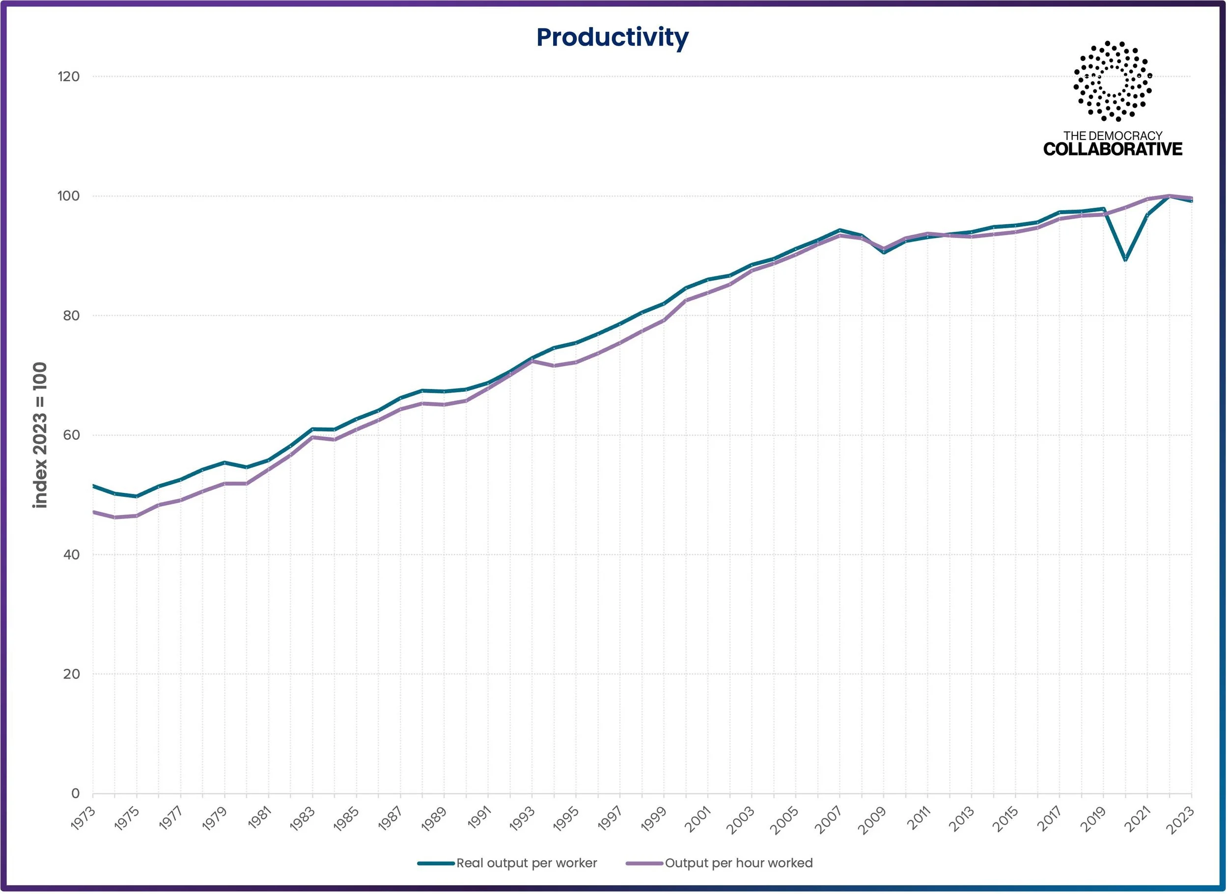
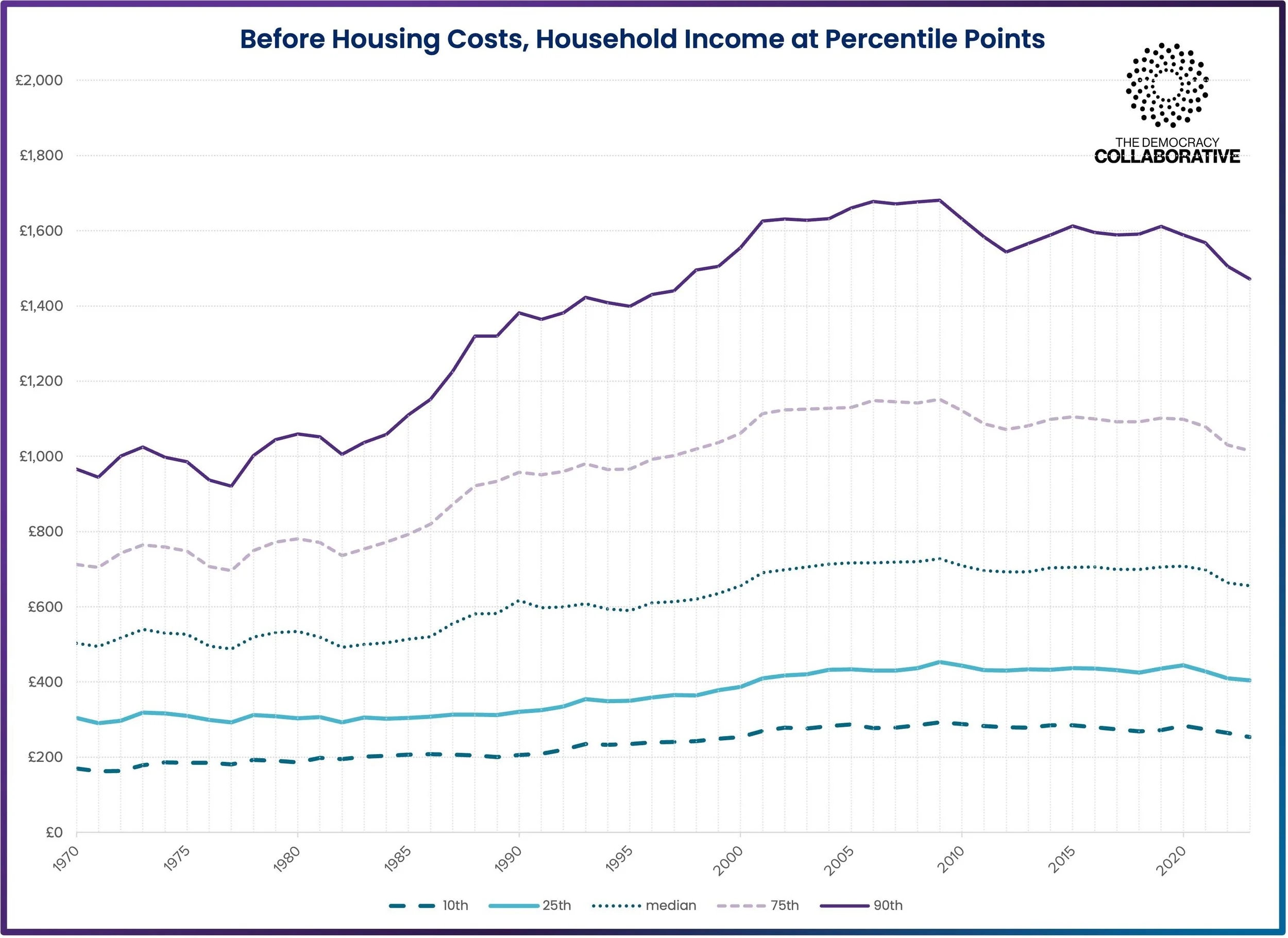
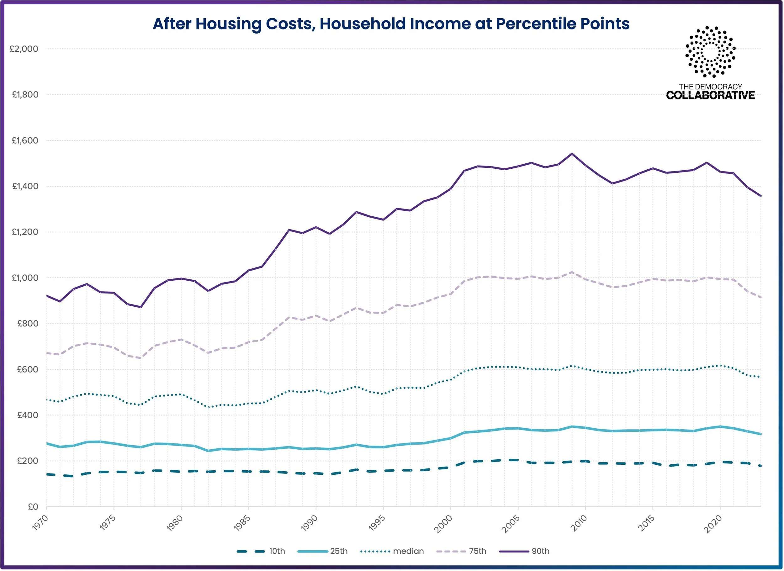
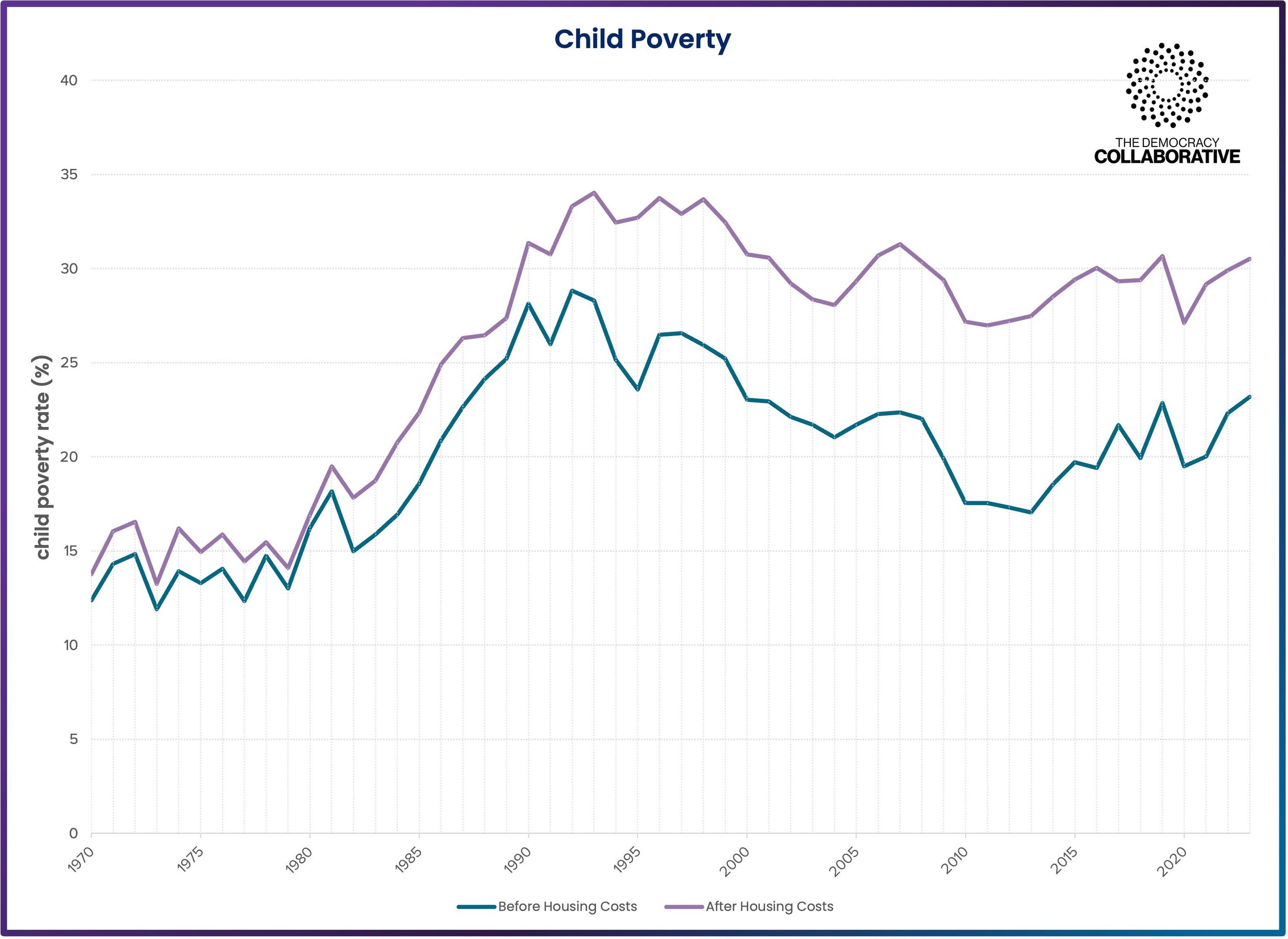
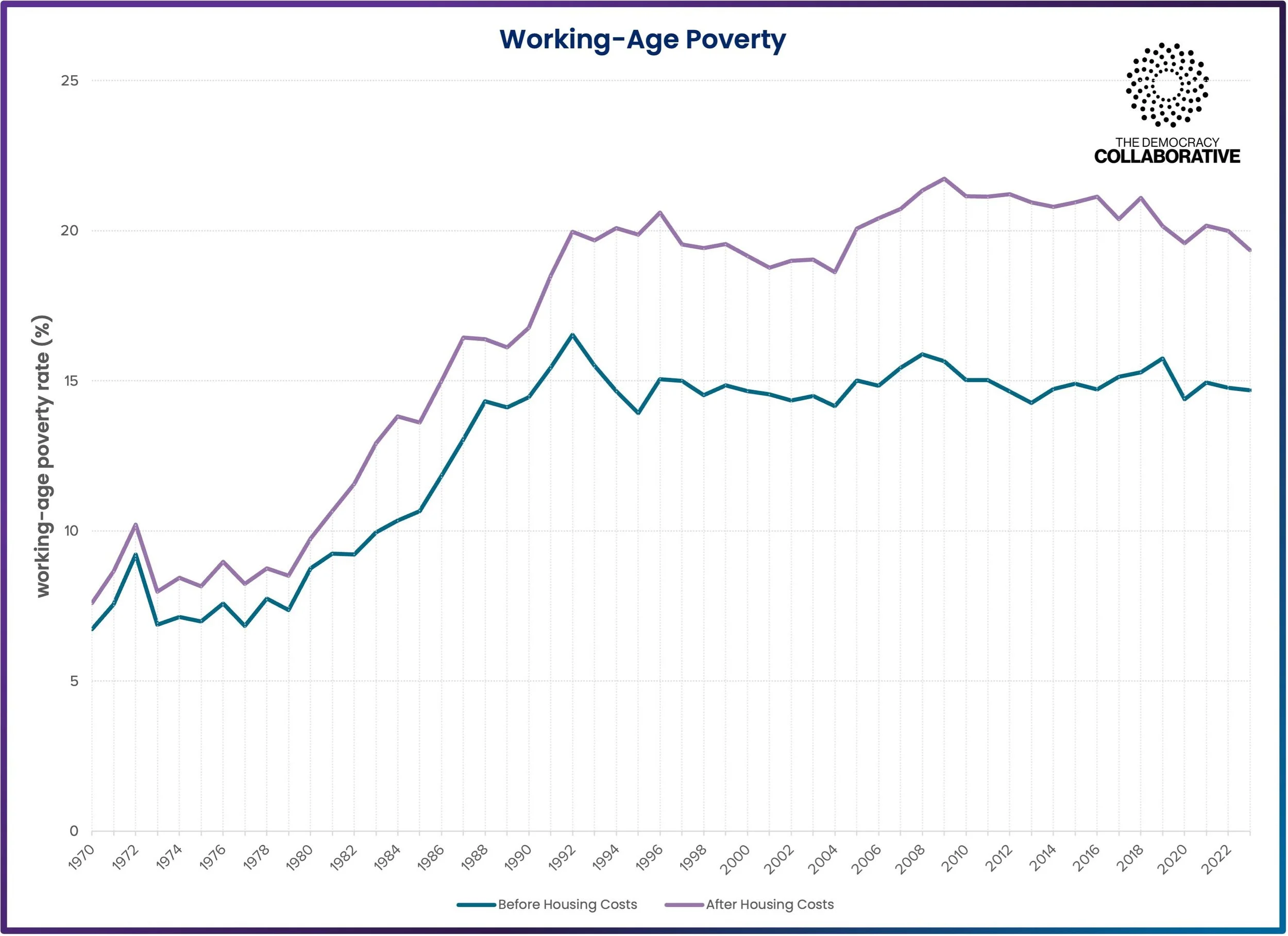
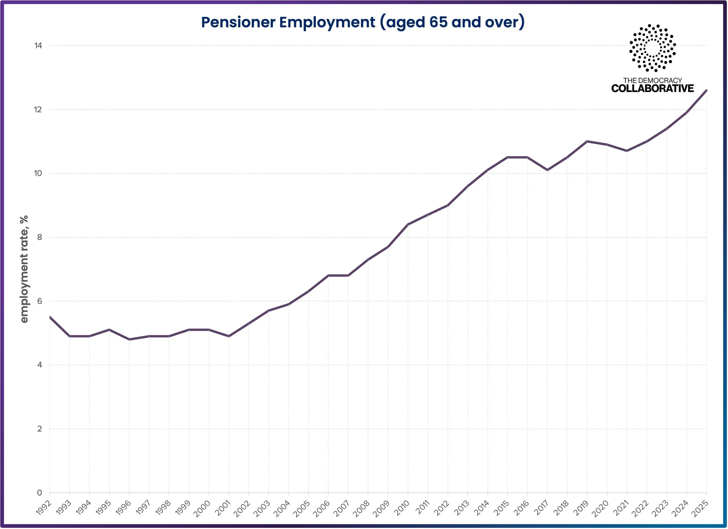
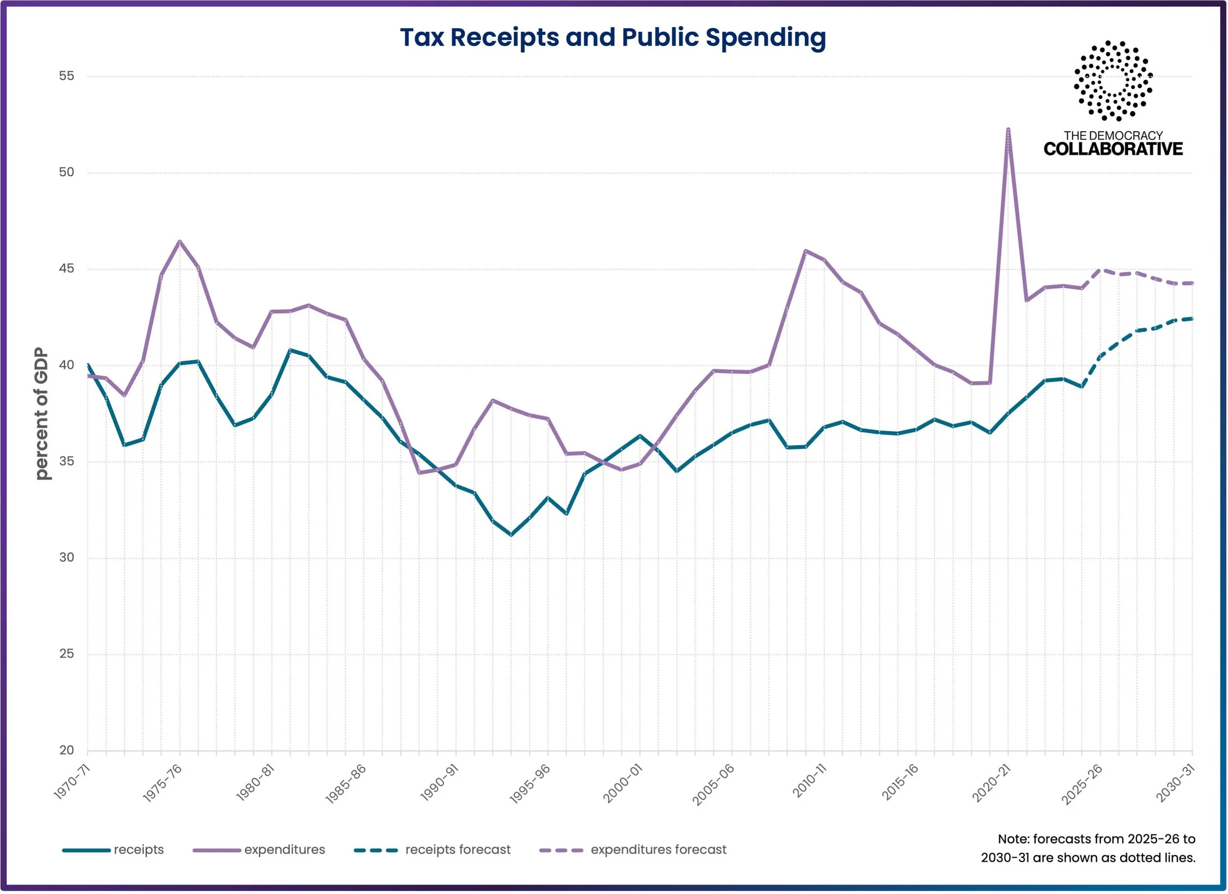
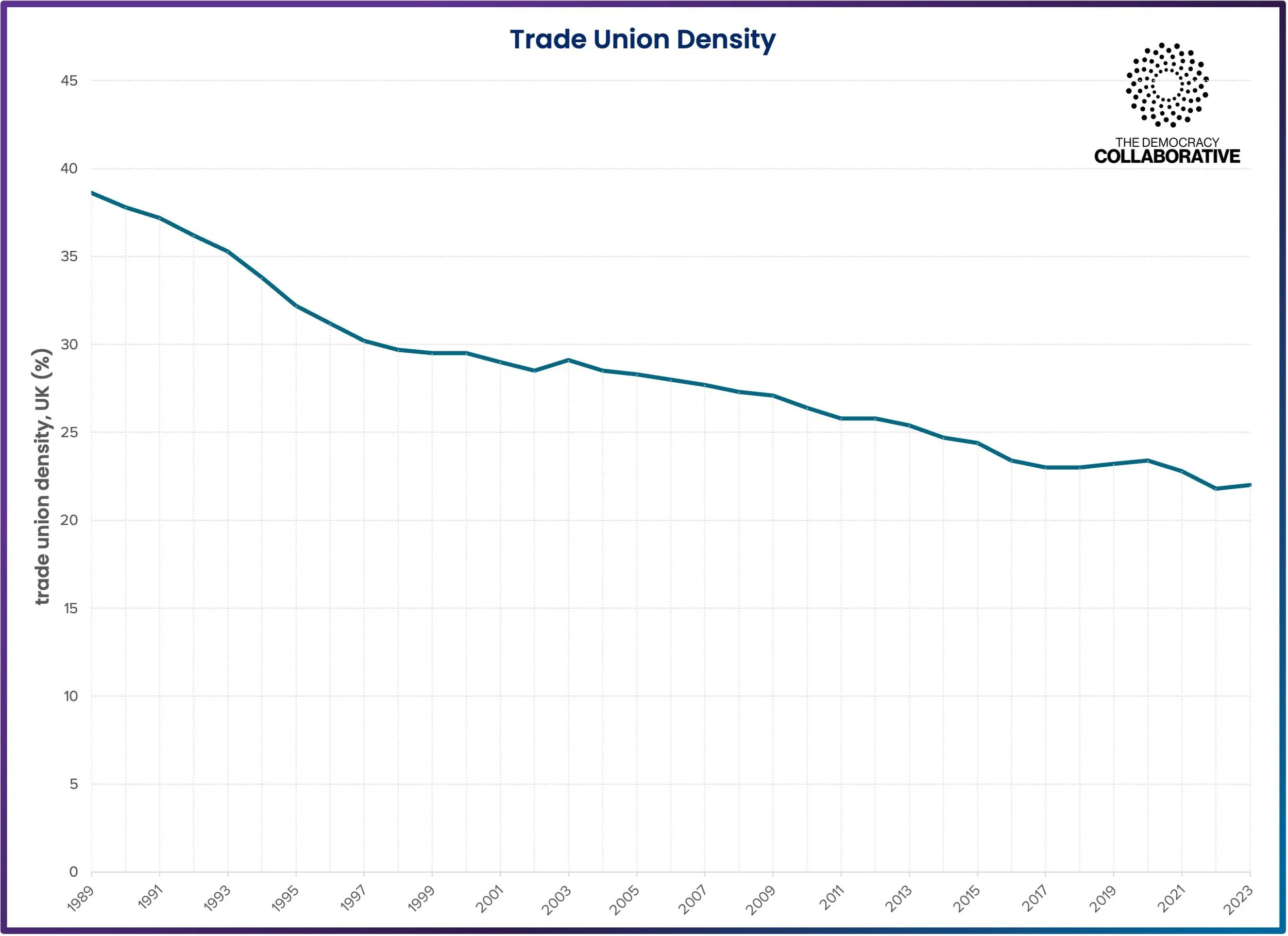
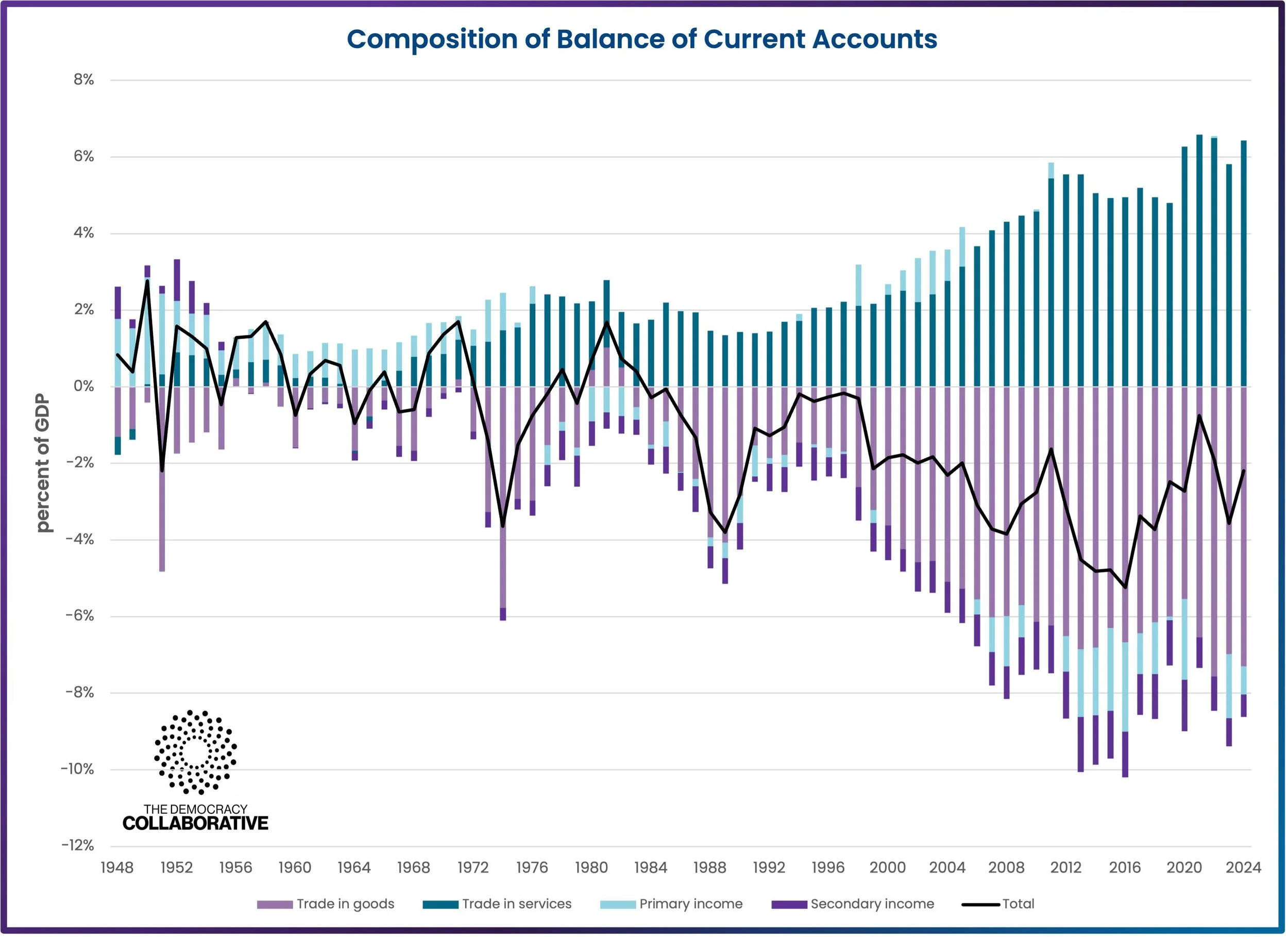
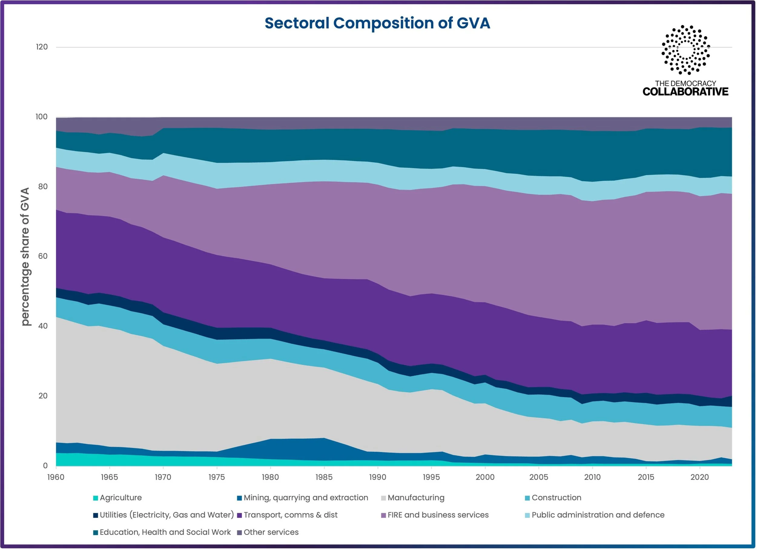
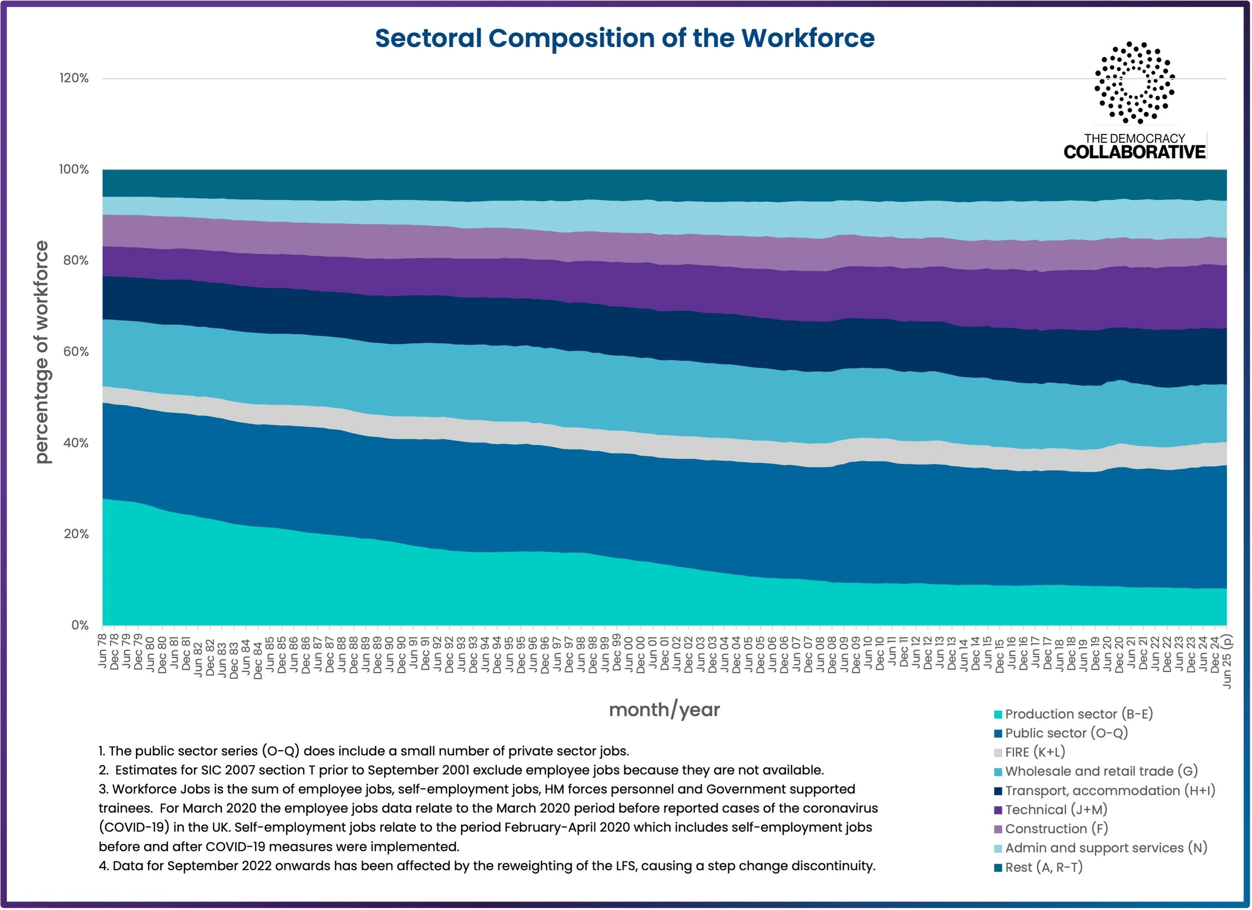
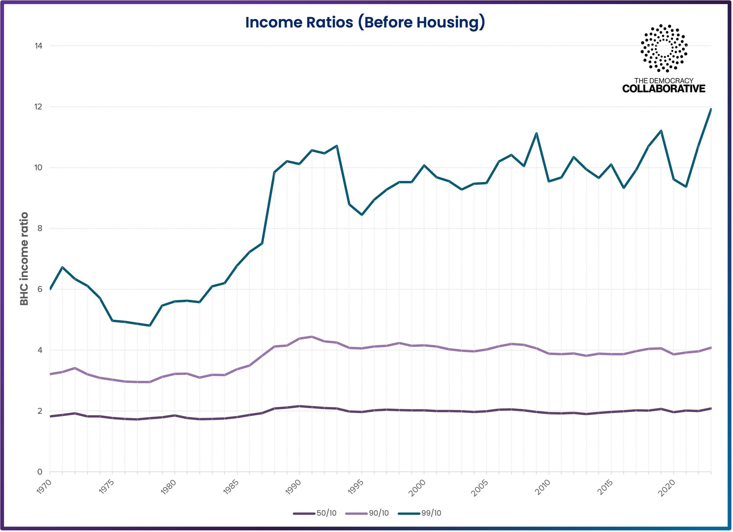
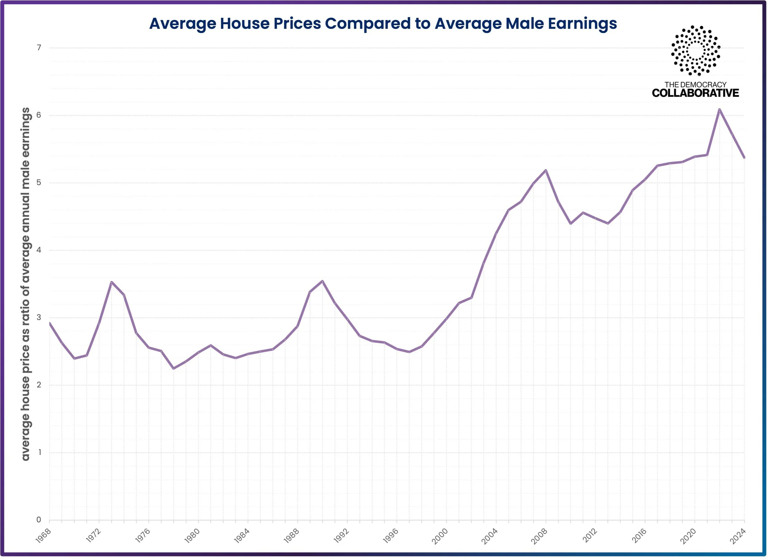
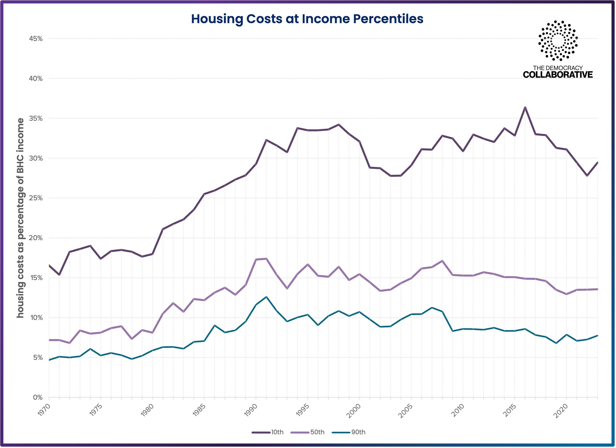
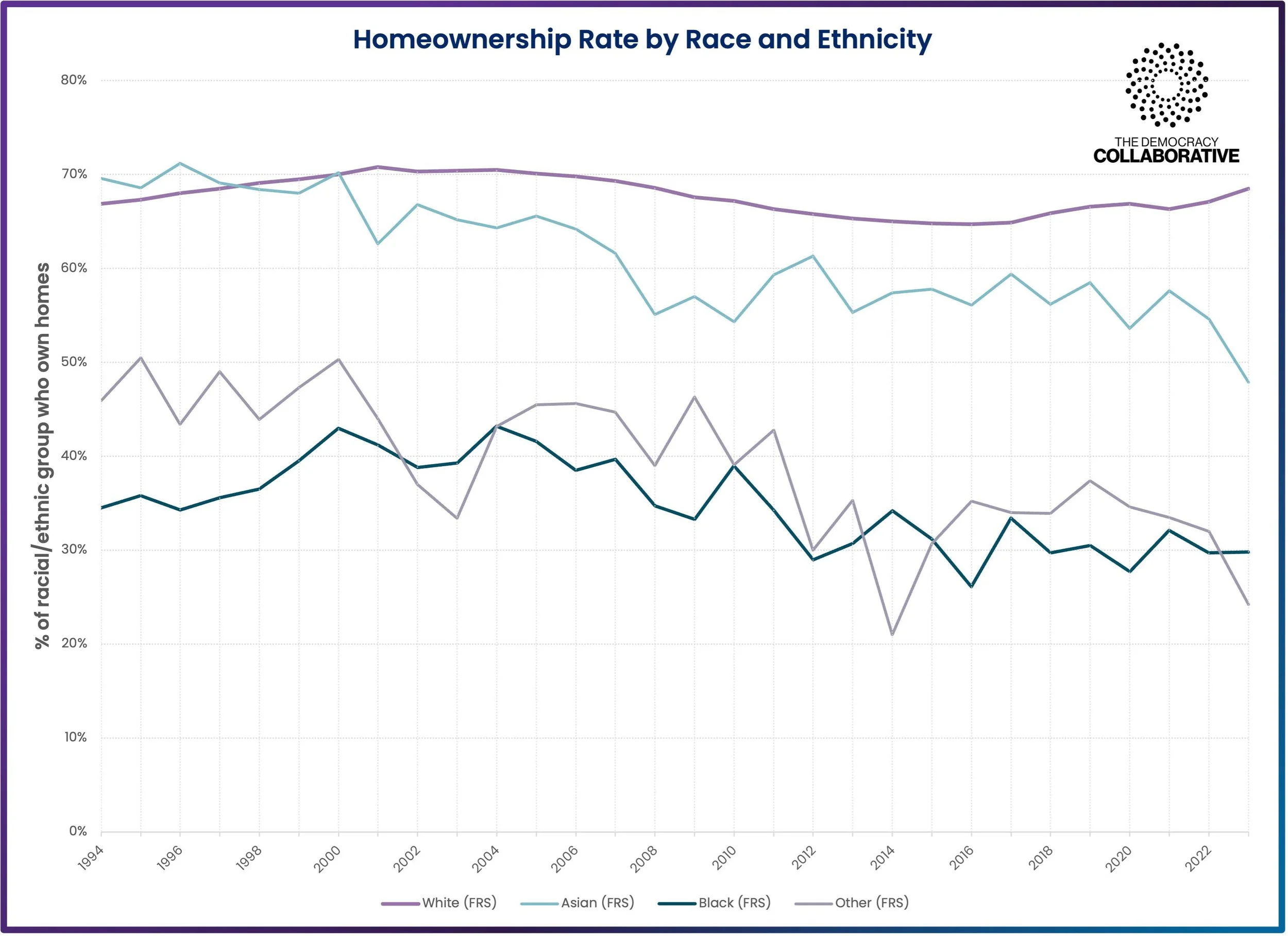
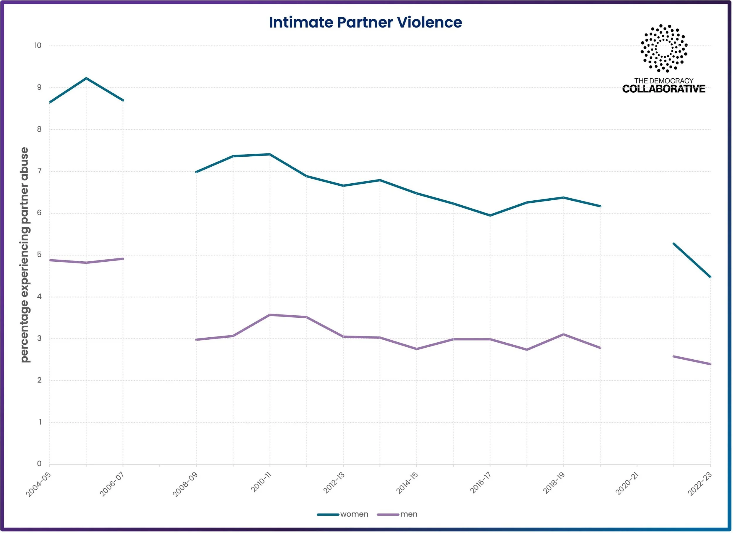
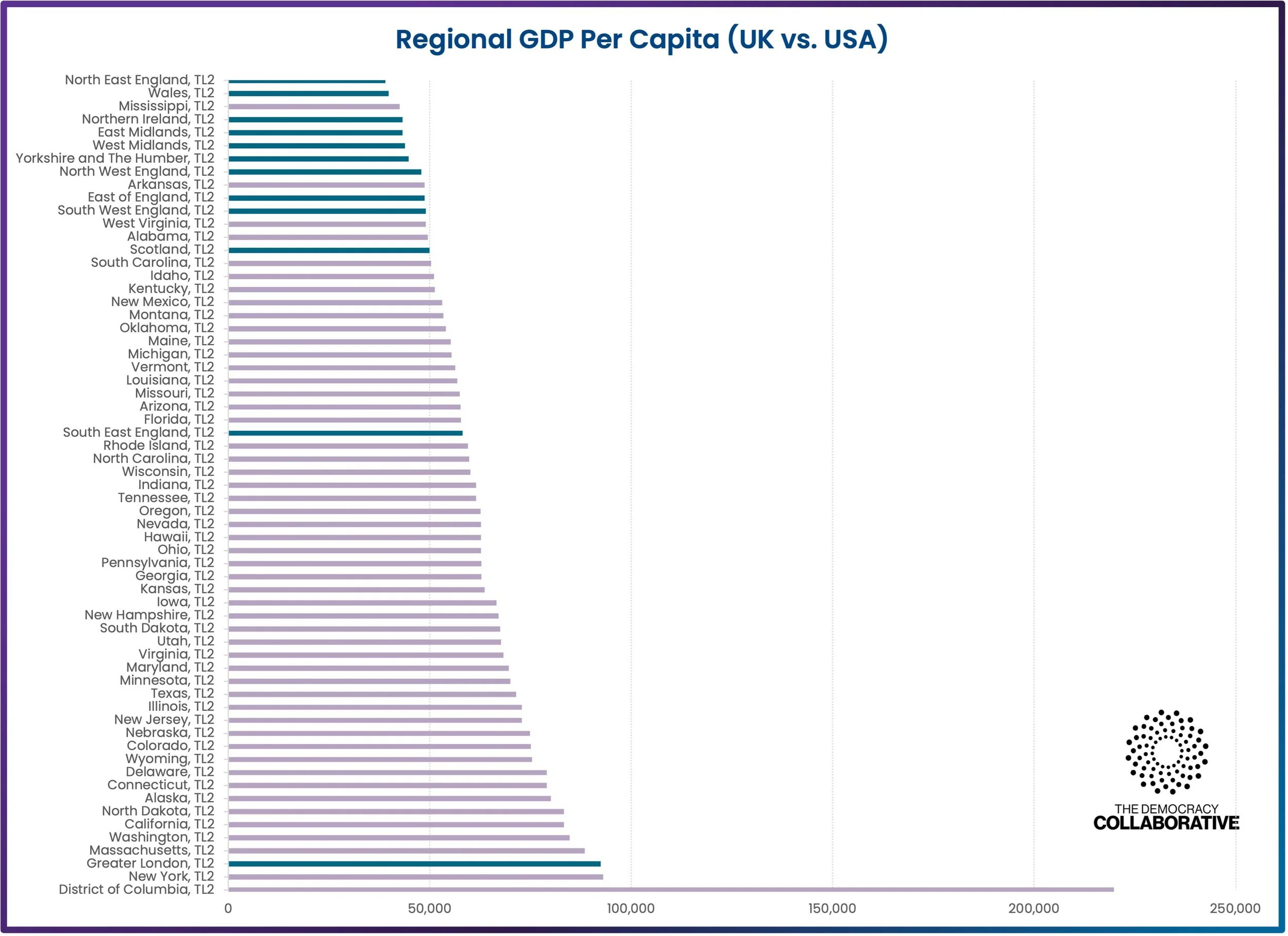
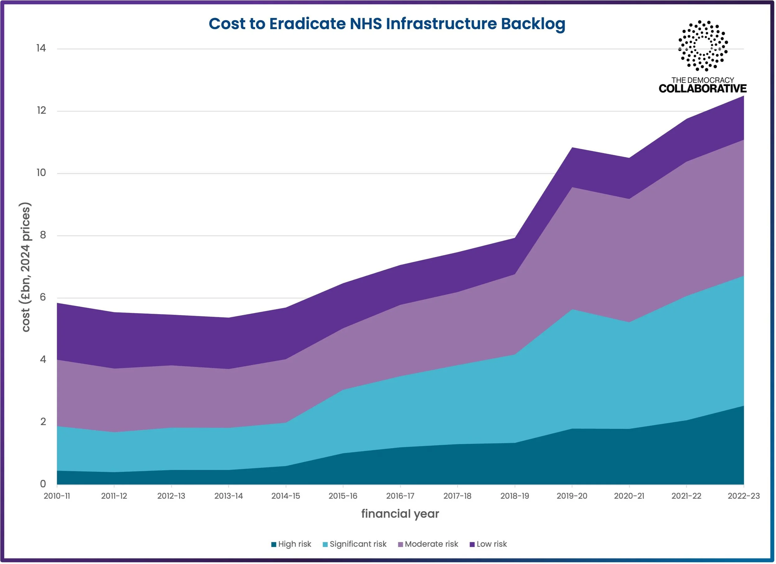